Anomaly refreshes Speedo’s branding ahead of the Paris Olympics
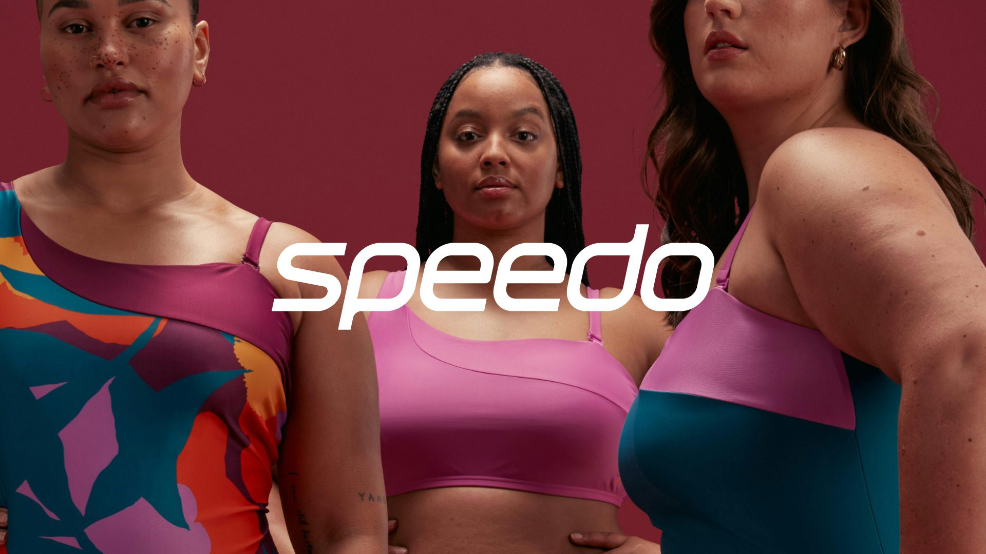
The new look aims to modernise the swimwear brand for a new generation and will appear across Australia’s 2024 Paris Olympics swimming team’s kit
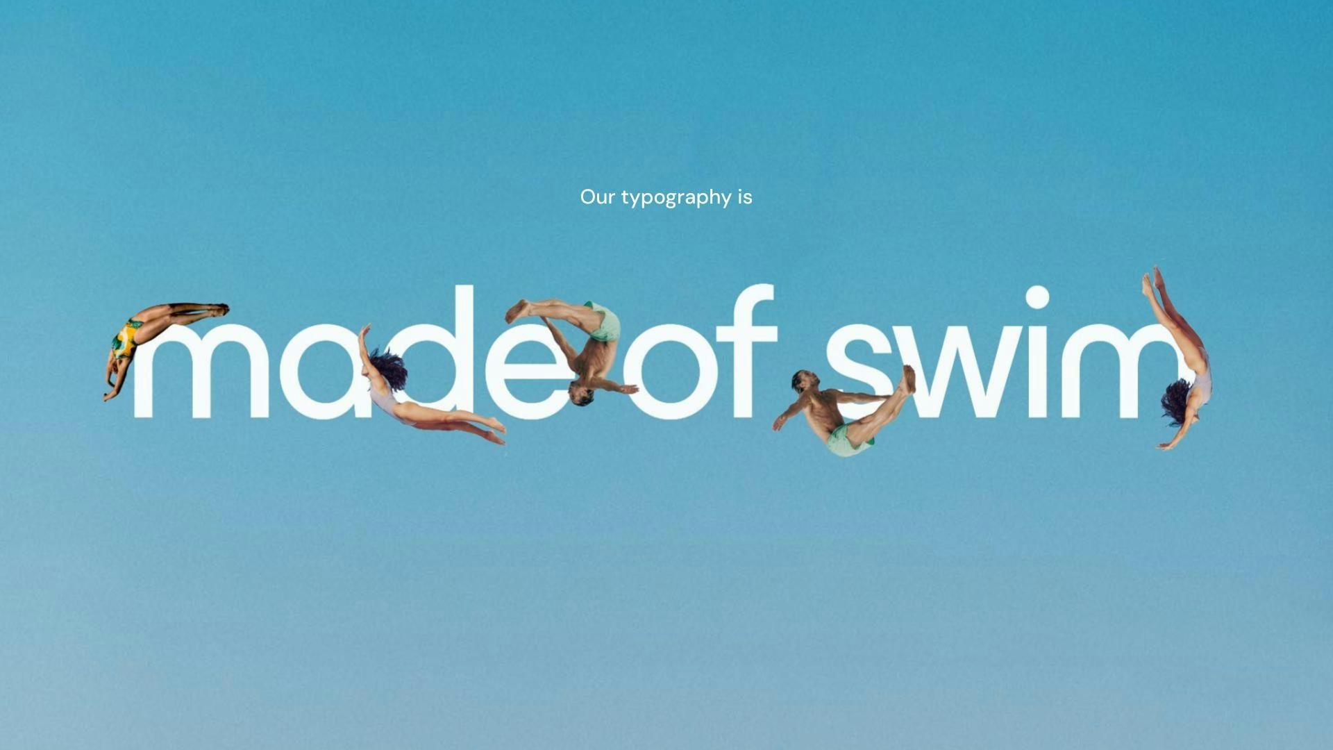
Anomaly used a central design idea – ‘for the love of swim’ – to help guide the development of the design and provide consistency. As the film below shows, the logo has a direct link to its most recent predecessor but has been adapted to work better in digital formats.
The wordmark has also been deliberately engineered to “perform and stretch” on swimwear fabric and products, with shortened ascenders and descenders and streamlined curves. The boom icon was then streamlined and optically attuned to the wordmark, resulting in two elements that also aim to support each other.
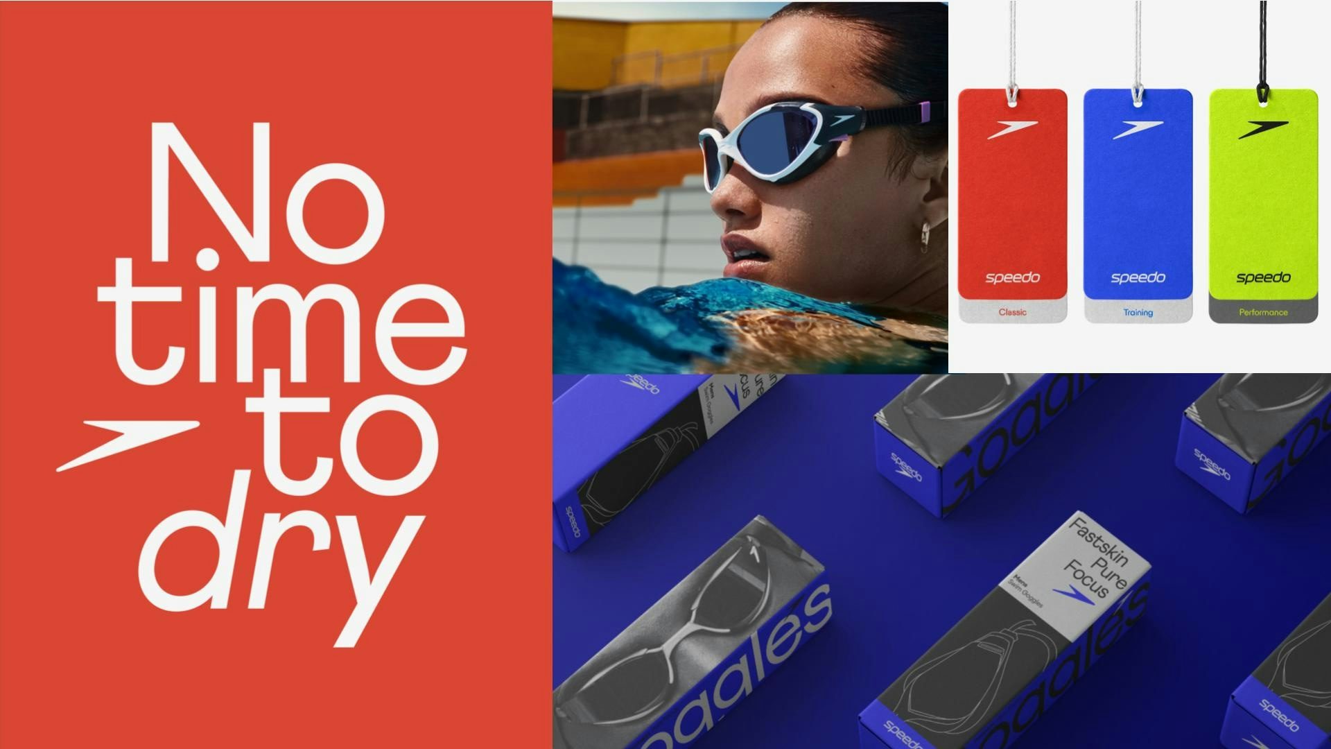
The team at Anomaly used swim forms to inspire a bespoke typeface, and created a design system inspired by the shape of pools and grids found in pool tiling. A new brand colour has been introduced too, based on a piece of research that identified a specific shade of green that is most visible underwater. This has been blended with ‘medal gold’ to created Speedo’s colour.
“The brief was to reposition the swim category’s biggest player, Speedo, in order to propel swim culture forward as a whole,” says Clara Mulligan, European head of design at Anomaly. “We partnered with the brand to create products for every body; through product innovation and trend-forward designs. From elite athletes to beginners in swimming – our work embraced all audiences, allowing them to fall in love with swimming in a way that was personal and meaningful to them.”