Coca-Cola’s Olympics packaging through the ages
The Coca-Cola Company’s Islam ElDessouky and Angus George at WPP Open X discuss the brand’s 96-year relationship with the Olympics and the approach to this year’s can design

This year’s Olympic Games marks 96 years since Coca-Cola became involved with the Olympic Movement, but it wasn’t until 1980 that it began to launch its limited edition packaging designs celebrating athletes and host nations.
The brand’s first commemorative packaging design was for the Lake Placid 1980 Olympic Winter Games. It featured “a simple design, utilising bold fonts and embellishing the eye-catching graphic nature of the Olympics logo at the time, whilst heroing the white of the iconic Coca-Cola red and white for the packaging,” says Islam ElDessouky, global VP of creative strategy and content at The Coca-Cola Company. “The glass bottles featured drawings of the mascot, Ronni the Raccoon, participating in different winter sports, alongside winning times and countries from the 1976 Olympic Games.
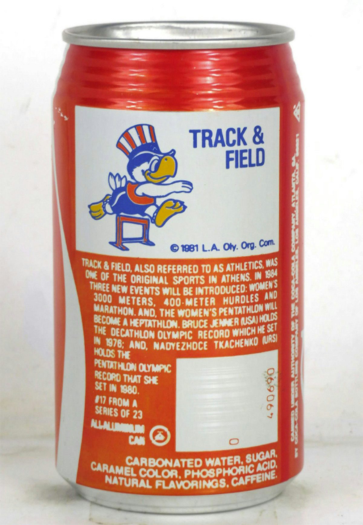
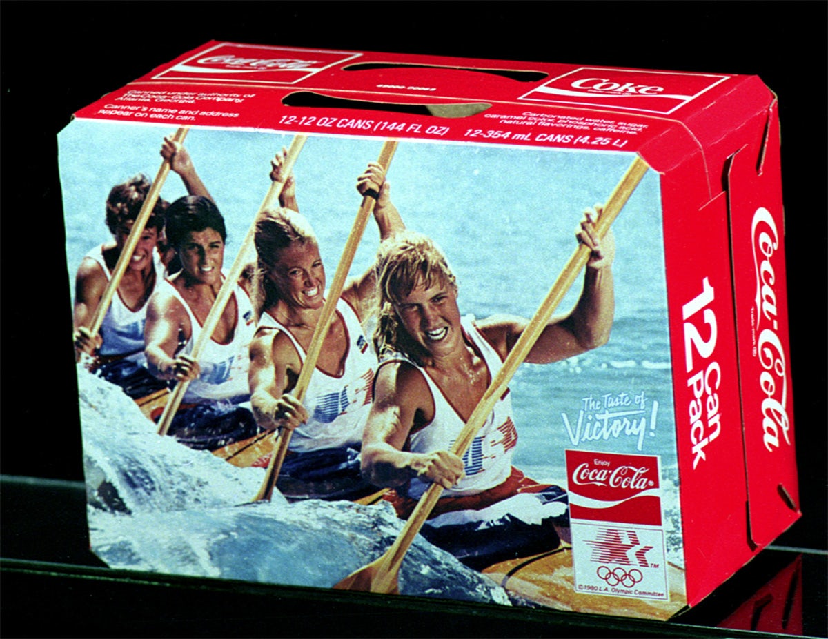
“But by the Olympic Games Los Angeles 1984, our designs were geared towards collectability with each can design featuring the Olympic mascot, Sam the Eagle, participating in different sporting events. The boxes for the cases of these cans were also commemorative, as they featured photos of athletes competing.”
More than just collectible memorabilia, the packaging designs have formed an interesting archive that holds a mirror up to specific design trends and tastes – much like the history of Olympic identity design.
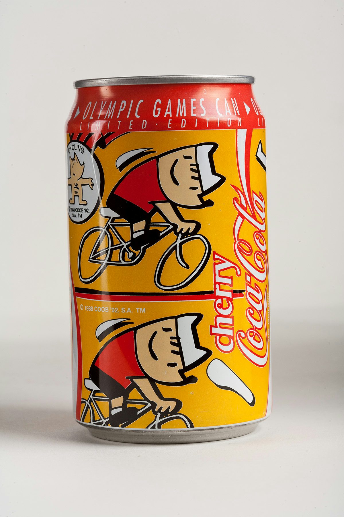
“Over time Coca-Cola’s product designs for the Olympic Games evolved to reflect broader cultural shifts and design trends,” says ElDessouky. “The early 90s design trends were all about bold colours, abstract shapes, and a playful, almost cartoonish aesthetic. Coca-Cola’s can for Olympic Games Barcelona 1992 really captured that spirit. We moved away from the classic red and white and embraced a vibrant yellow colour palette inspired by the Spanish flag, using bold animation.”
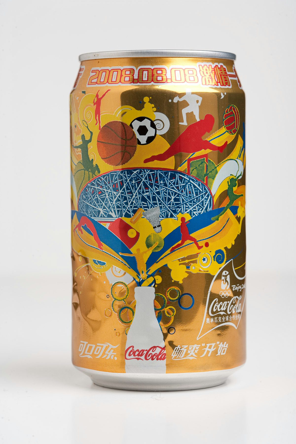
“By the 2000s, we were incorporating more of the host country’s culture and visual language into our Coca-Cola can designs. You can see this in our beautifully ornate and somewhat futuristic design for the Olympic Games Beijing 2008. The can was gold and not only incorporated visual cues of the Olympic Games through animation, but also traditional Chinese calligraphy,” ElDessouky explains.
“Ultimately, our goal is to create something that’s both a celebration of the Olympic Games and a reflection of the times. It’s always exciting to see how people respond to the designs.”
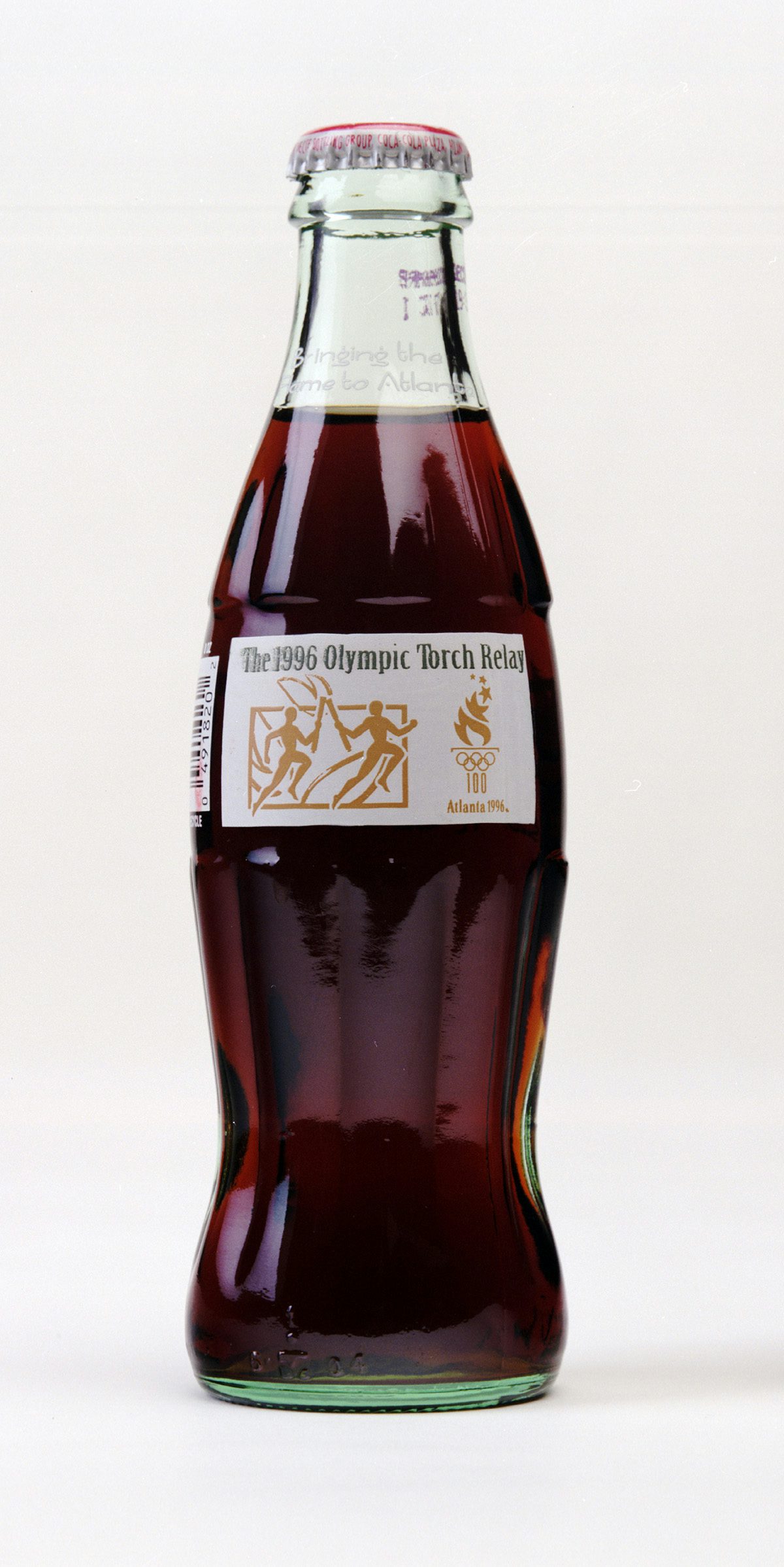
Of all the designs, ElDessouky’s favourites are the glass bottle created for the 1996 Games in Atlanta – Coca-Cola’s home city since 1979 – and, perhaps unsurprisingly, the interlocking cans designed for Paris 2024, which he says encapsulates the campaign message, ‘It’s magic when the world comes together’.
Created with the help of French artists Laura Normand, Aurelia Durand and Bruno Mangyoku, the can illustrations create an embrace when placed together. “This required the most simplicity of thought and design, to elevate the can, not clutter it, but still enable it to stand out on the shelf,” says Angus George, ECD at Ogilvy UK and a creative lead at WPP Open X – the agency model set up specifically to work on The Coca-Cola Company.
“Our design team went through numerous iterations, experimenting with different illustrations and placements to ensure the hug felt natural and visually appealing. We also wanted to make sure the cans worked both individually and as a pair, each telling part of the story.”
“When you’re working with two of the world’s most recognisable pieces of brand design – the Coca-Cola script and the Olympic rings – you don’t take this task lightly. Not only do you want to respect the power of both brands, but you want to live up to the heritage that comes with them. And on top of that, the whole world is watching.”


