Saint Urbain creates identities for a rural hotel and restaurant
The design studio has created the new branding for a historic hotel and its sister restaurant in the Catskill Mountains in New York state
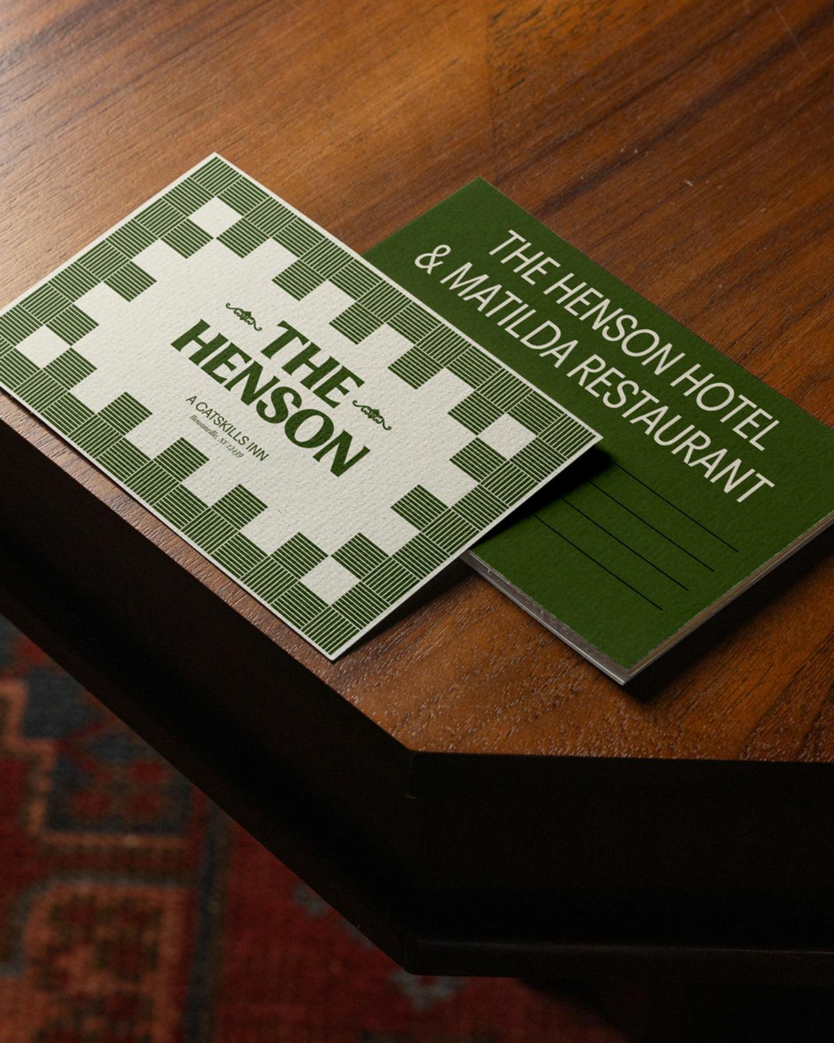
The Henson hotel in the Catskills has had many lives. Initially a boarding house in the 19th century, before going through several iterations of being a hotel and then an Airbnb, its latest venture is in the hands of chefs and restaurateurs Jeremiah Stone and Fabian von Hauske Valtierra. With two other establishments to their name in the same town, Hensonville, the pair recently partnered with renovators Danielle and Ely Franko on a new hotel, The Henson, and its sister restaurant, Matilda.
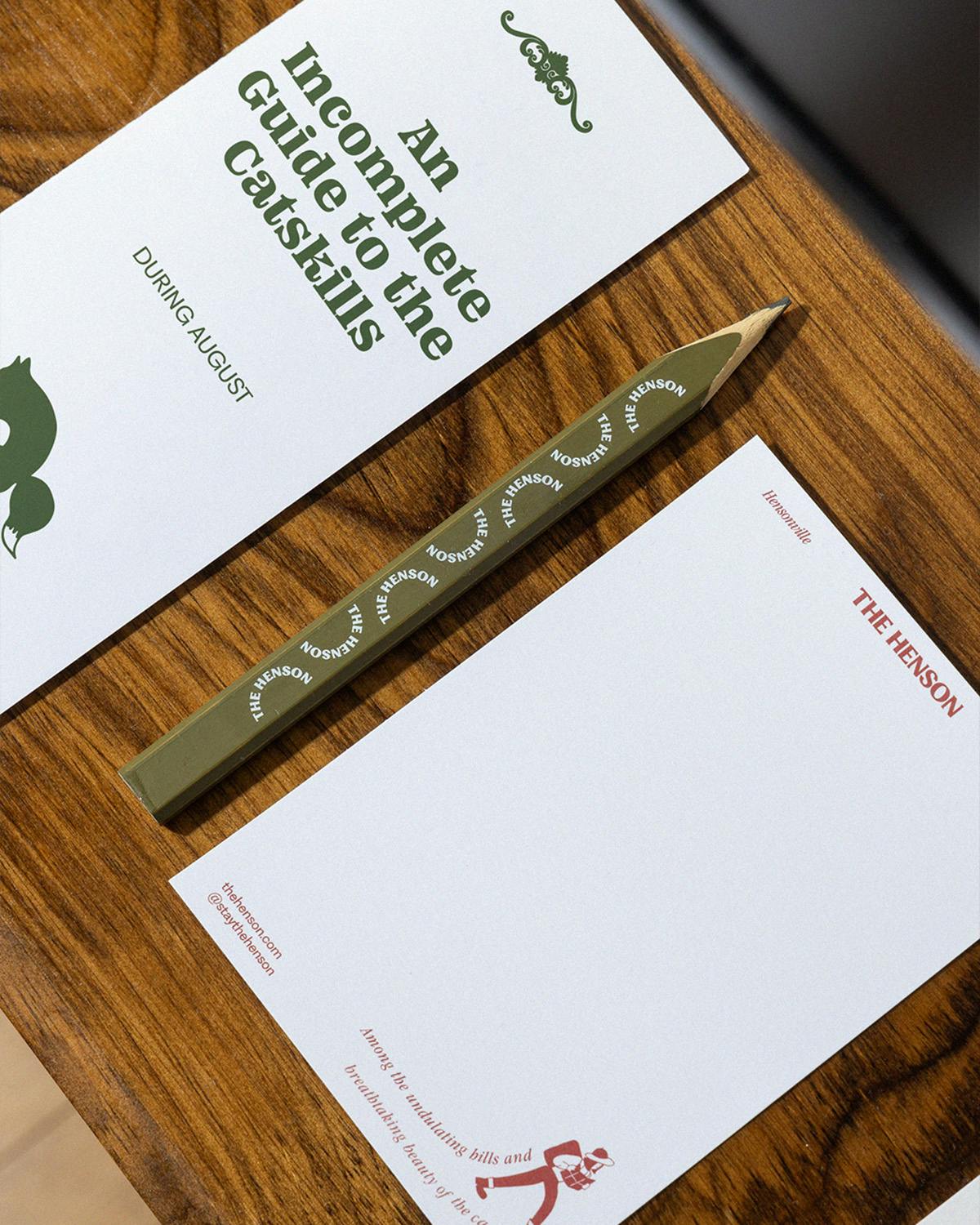
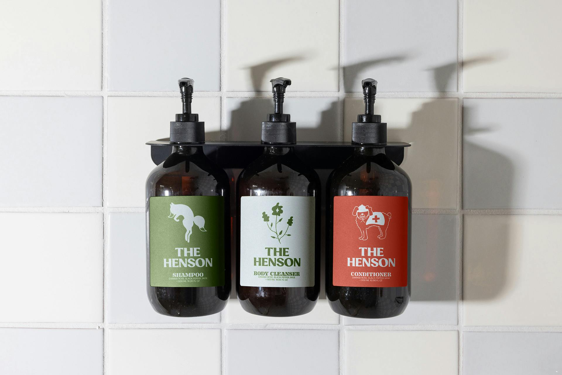
At the heart of the establishment is an organic garden that connects it to the surrounding region, which in turn provides a throughline in both The Henson’s and Matilda’s identities, designed by creative agency Saint Urbain. The local area isn’t just an aesthetic reference point; restaurant dishes at Matilda incorporate ingredients sourced from the Catskills, while The Henson is a base for exploring the surrounding wilderness.
To create the identities, Saint Urbain struck a balance between the elegance of the interior design throughout both establishments and the beauty of the natural surroundings. While the hotel’s design gently leans into luxury cues, the restaurant is meant to feel more relaxed – yet they ultimately needed to be harmonious.
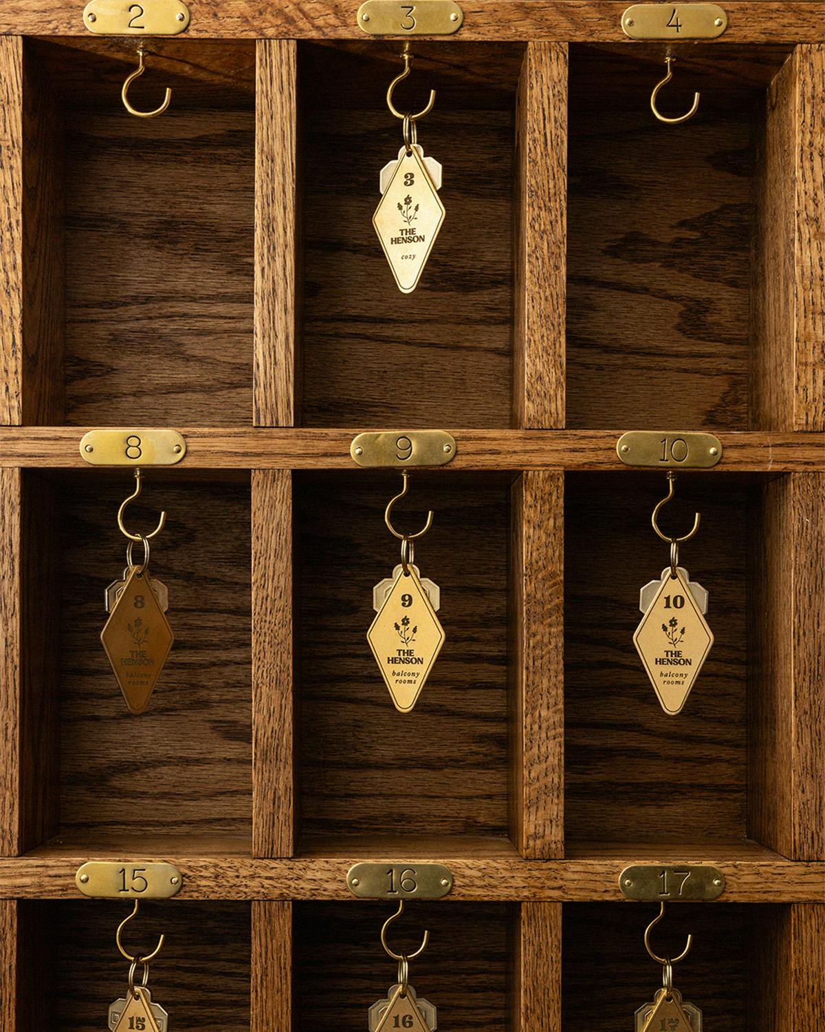
The Henson’s branding quietly nods to the hotel’s 19th-century origins, according to Saint Urbain founder and creative director Alex Ostroff. “We wanted to pay our respects to the history of the building that has housed so many different people over a hundred years and have a logo that felt like it could have been there when it opened. It needed to feel authentic and historical, but still modern and cool to match the incredible interiors.”
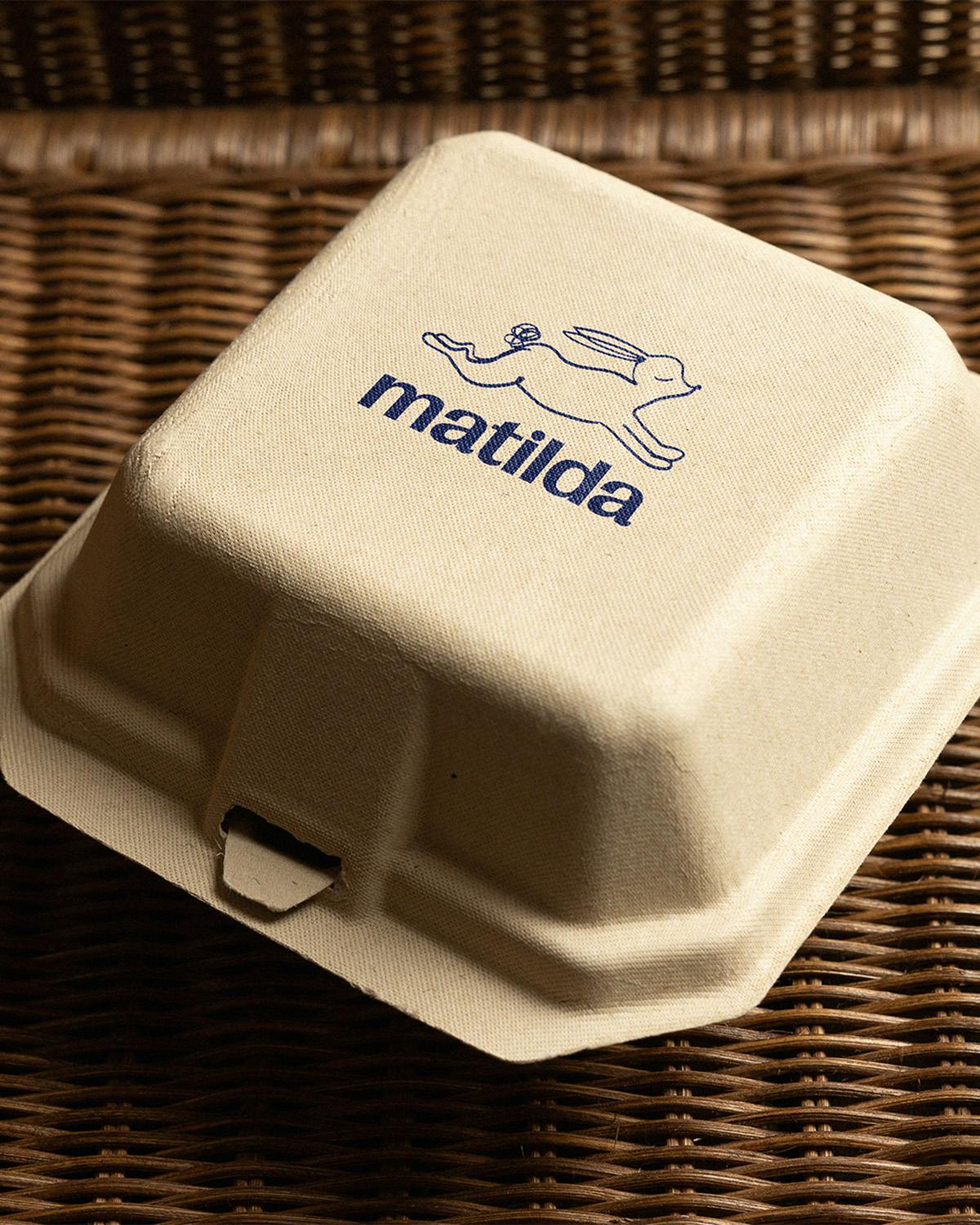
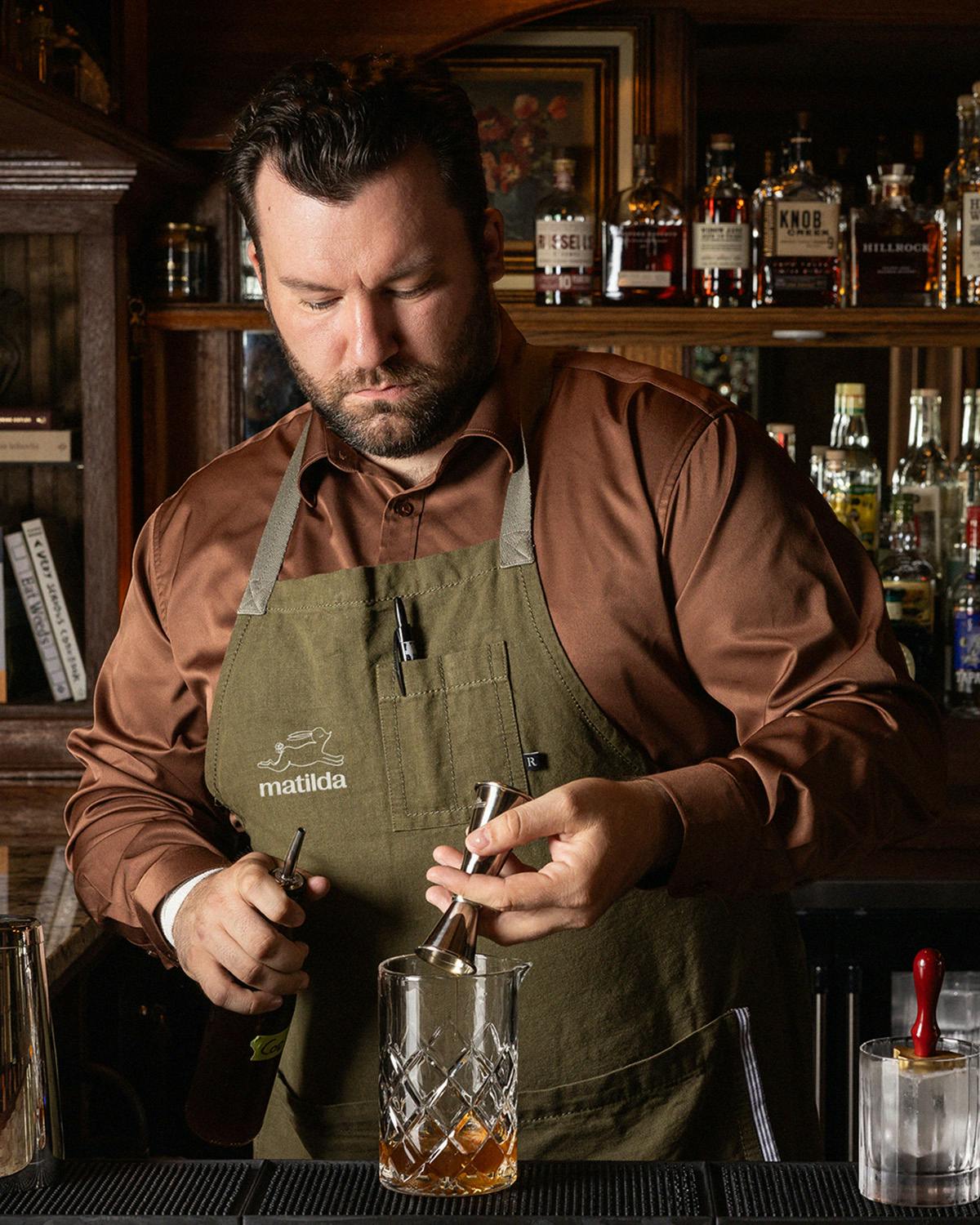
“For Matilda, we could be a bit different when it came to the logo and visual language. The chefs Fabian and Jeremiah are extremely famous in the food world, for running two of the weirdest and most delicious restaurants, Wildair and Contra Bar, which just re-opened. They bring a level of creativity to the table and their menu, which is fine [dining meets] approachable dining with lots of quality ingredients grown, raised and produced in the Catskills.”
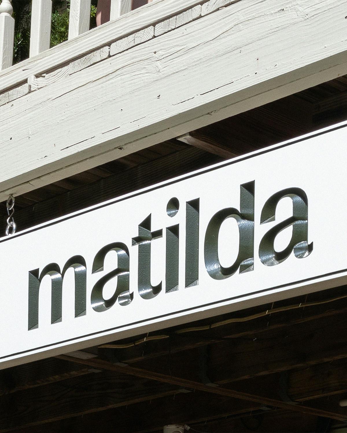
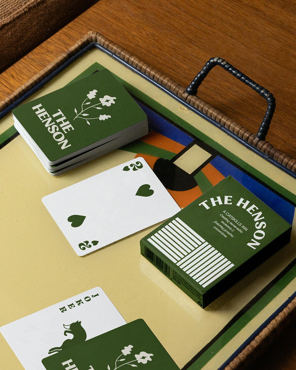
The typeface used for both establishments was chosen to “evoke a simpler age where time passed more slowly”, something most visitors to the Catskills are in pursuit of. Hand-drawn illustrations are also a feature shared by both identities, as are the natural cues.
“Matilda is truly a little sister to Henson. The connective tissue between the concepts is certainly the flora and fauna of the area, similar to Henson, but with more of a rough handmade detail to connect to how personal the dishes are and how local the ingredients are. Named after our client’s grandmother, we immortalised her with a character wearing a hat. And of course, we have our mascot character, a self-assured rabbit, representing the playfulness of the chefs and the menu.”