Repackaging the London Transport Museum
Undoubtedly one of the most recognisable visual languages of any transport network, the typefaces and graphic elements of London’s tubes and buses have heavily informed the new look for the London Transport Museum’s retail offering
The London Transport Museum (LTM) is an iconic landmark and area of interest in London, yet the team behind the brand felt that its retail experience was lacking, with no real storytelling element to connect it together. As such, they reached out to local design agency Kit Studio for help with reawakening the museum’s rich heritage and allowing this to come through in the shop and products.
Following an extensive research period, involving visiting the museum depot in west London to study archival aspects of the network, trace bus maps, and discover recognisable architecture from along the various tube routes, the designers developed a new, reinvigorated retail identity and packaging system for the museum.
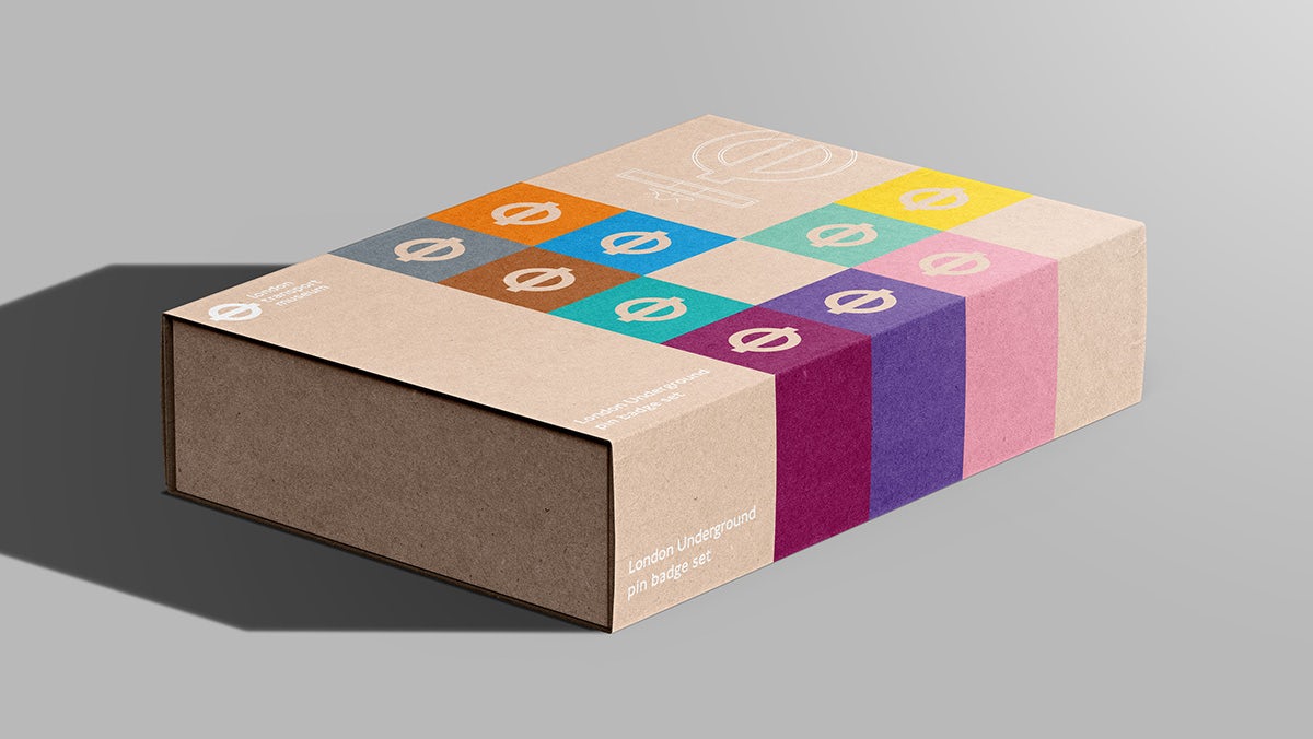
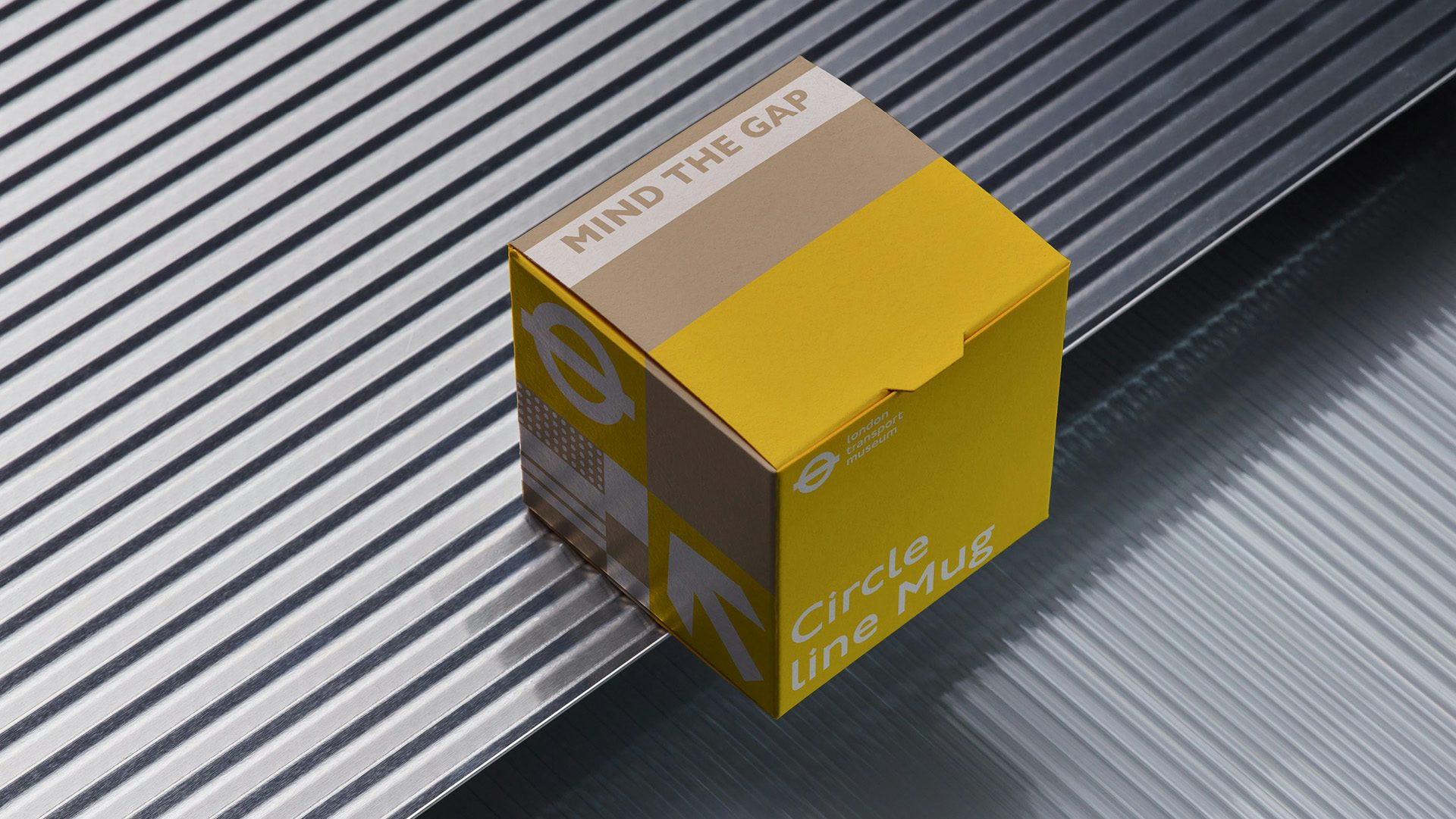
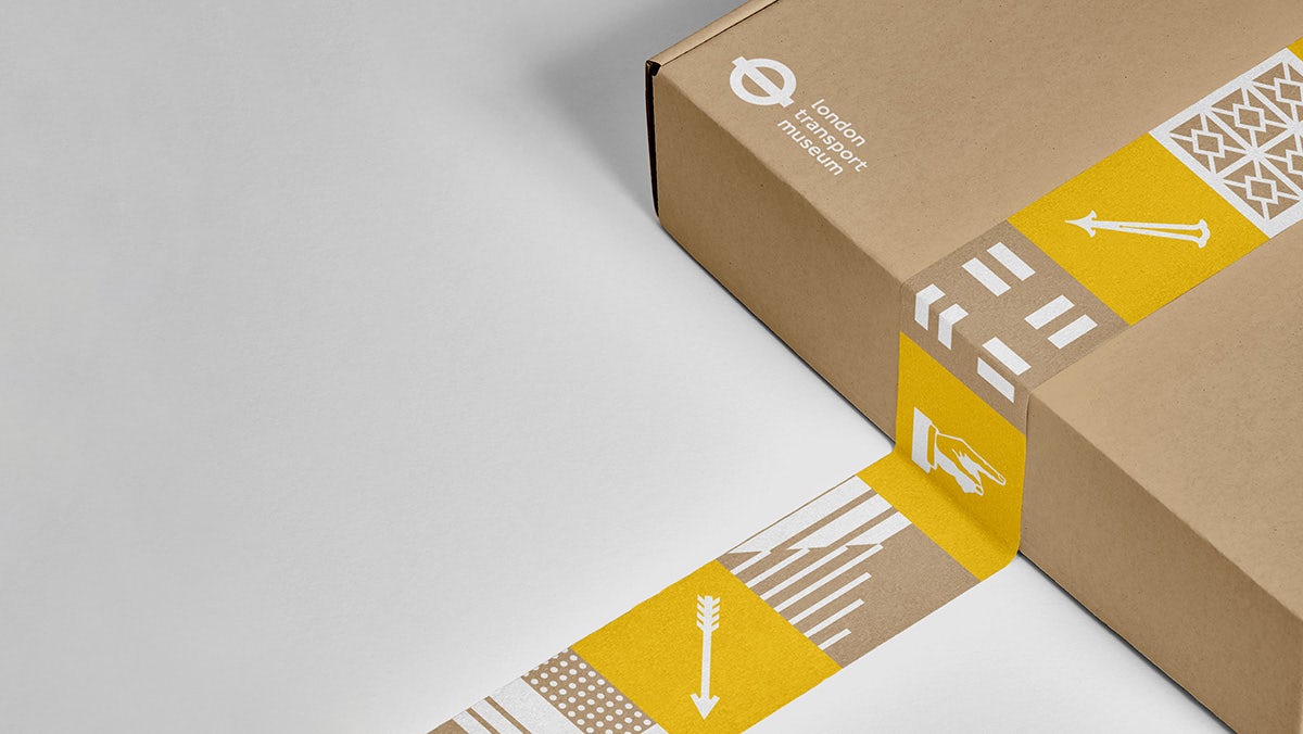
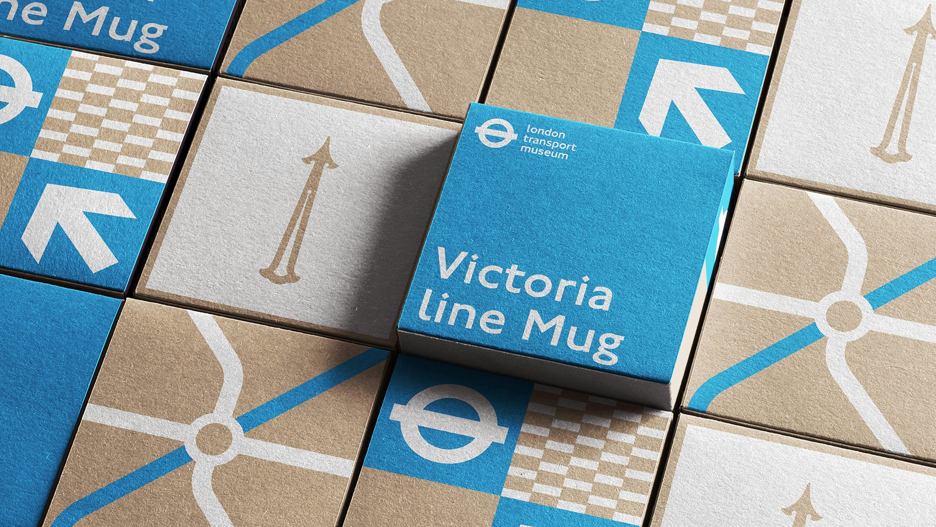
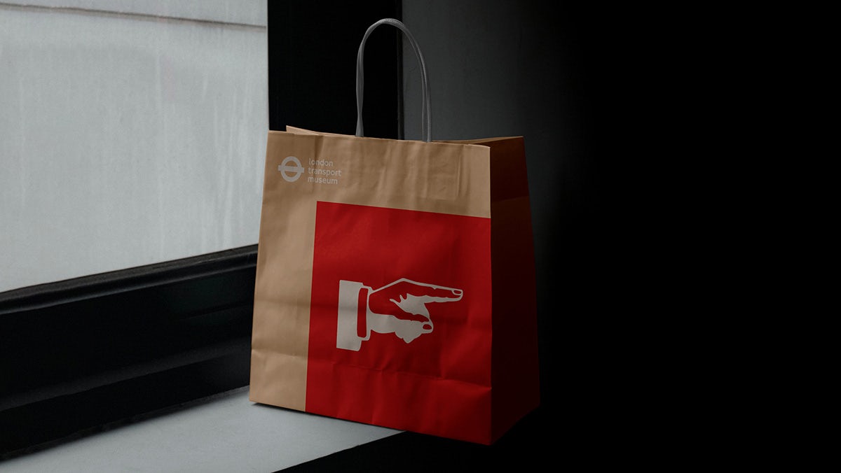
Featured in the new identity are design elements that have been taken from the history of London’s transport. These include eclectic bits of signage, illustrative arrows, moquette seat patterns and, of course, the iconic roundel logo. From mugs to board games and even the cups used in the in-store cafe, the recognisable visual language of the city’s tube and bus network takes centre place. With every detail considered, Kit has managed to do this in a way that pays homage to the heritage, while also adding a refined, contemporary touch to the designs.
Another noticeable feature of the identity is the bright colour palette, which takes shape through a system of graphic tiles found on various physical objects. Unsurprisingly, the bold red hue we’ve come to associate with the city’s tubes and buses is dominant within the palette, helping it to feel quintessentially London. This is further cemented by the inclusion of the Johnston typeface – the corporate font of public transport in London – that adorns many aspects of the branding.
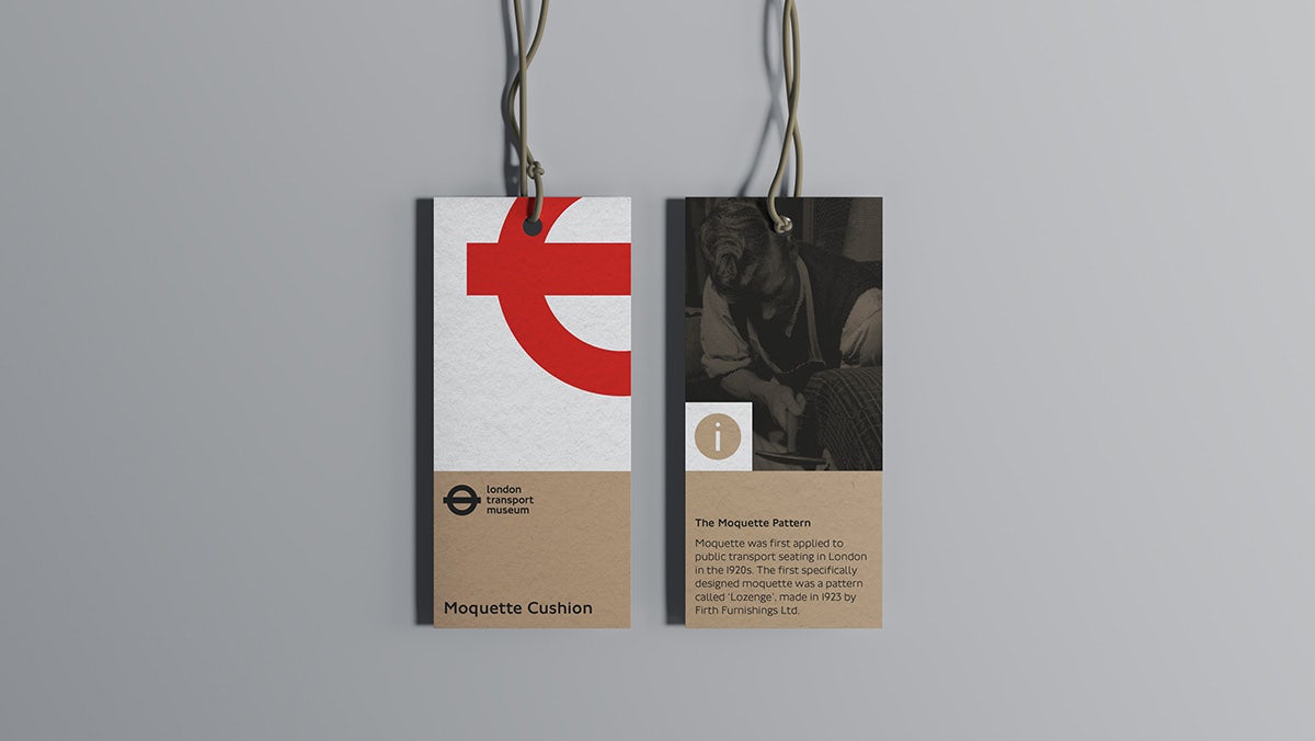
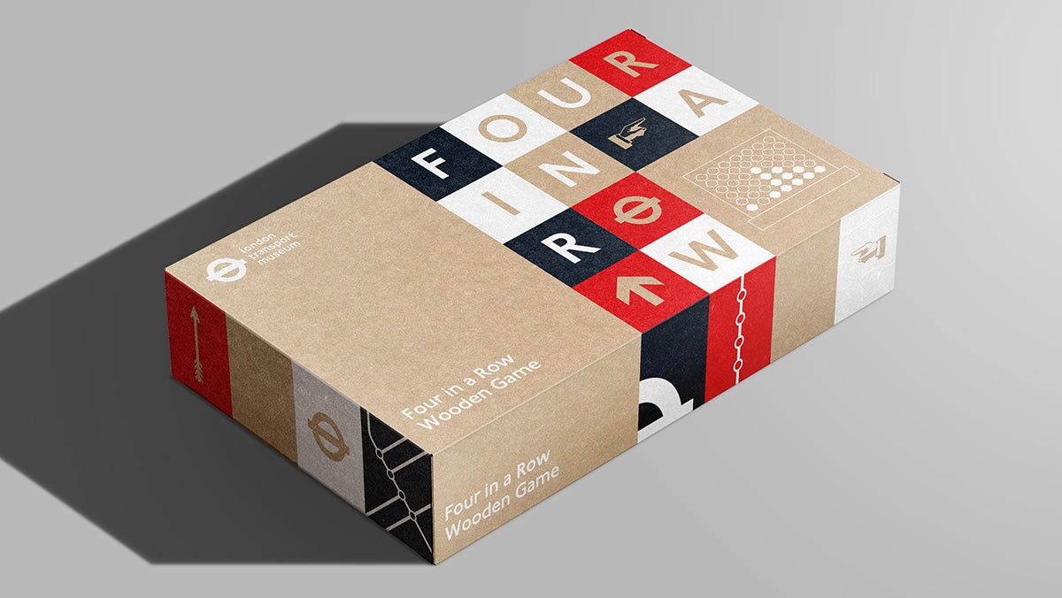
With sustainability a significant focus for the museum team, the identity “encourages best practice” with the removal of plastic windows, the introduction of kraft boxes and new reusable peg boards for POS.
“Working with a brand with such a rich design heritage gave us the opportunity to create a flexible identity that truly represents the story of London transport,” said Kit Studio’s Chris Bounds. “From delving into the archives to researching transport journeys, we created a system that is instantly recognisable as London, with an added level of storytelling that encourages customers to explore the packaging.”