
Mozilla reintroduces itself with a new identity
The community-led software organisation hopes to cement itself as a reliable and accessible voice in tech
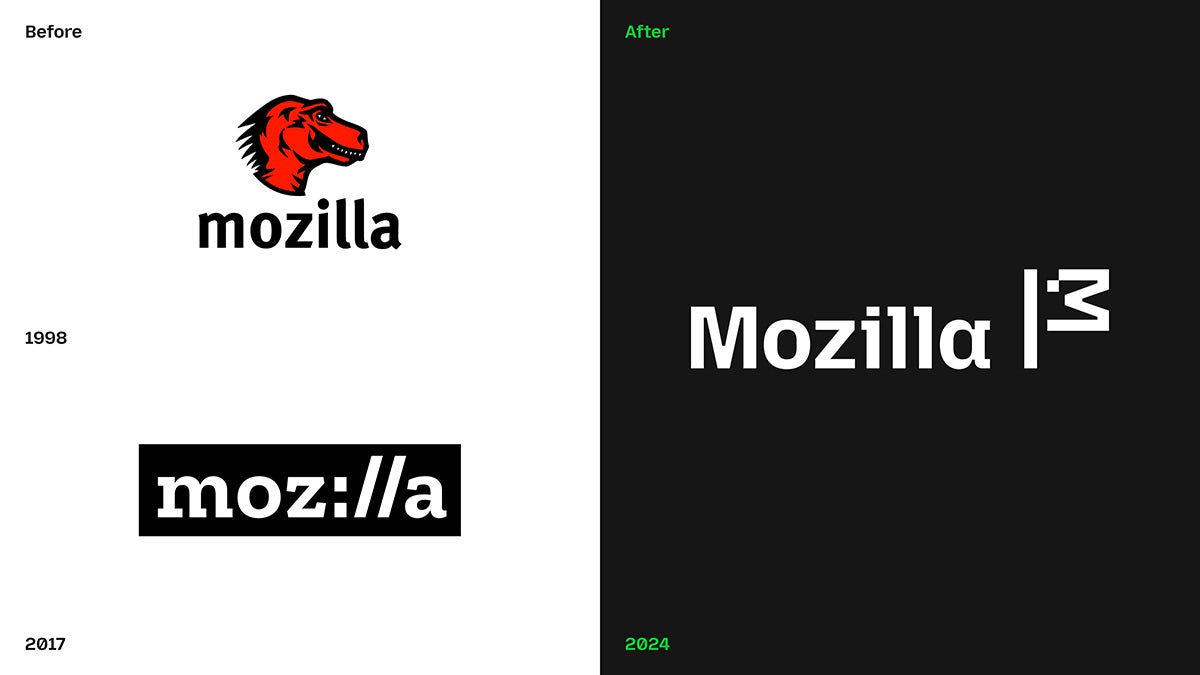
Founded in San Francisco in 1998, Mozilla is a free software organisation run by a global community of technologists and developers. While it has several ventures and projects to its name, particularly data protection products and VPNs, Mozilla is probably best known for its open-source web browser Firefox – though even that had dropped off the radar, with TechCrunch noting recently that other notable alternative browsers such as Arc have overshadowed it in recent years.
“Since open-sourcing our browser code over 25 years ago, Mozilla’s mission has been the same – build and support technology in the public interest, and spark more innovation, more competition and more choice online along the way,” says Mozilla president Mark Surman. “Even though we’ve been at the forefront of privacy and open source, people weren’t getting the full picture of what we do. We were missing opportunities to connect with both new and existing users.”
After DesignStudio stepped in last year to help devise its new ‘Reclaim the Internet’ brand strategy, Mozilla has now revealed a new visual identity created by the UK and US offices of Jones Knowles Ritchie (JKR) that aims to reflect the ethos that it’s “not your typical tech brand”, according to the agency’s global ECD, Lisa Smith.
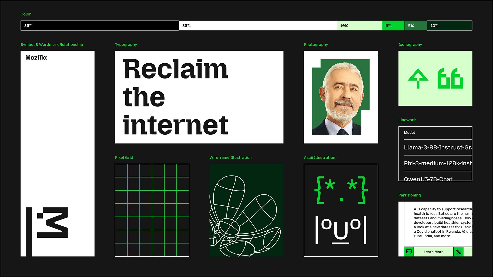
The aim was to create an identity that would feel robust enough for more formal contexts but could stretch to be more playful and flexible when it speaks to its grassroots community.
The new identity foregrounds the Mozilla name in a bid to free it up from its core association with Firefox as it pursues new products and an emphasis on AI. The updated wordmark is based on a new typeface and is headed with a new uppercase ‘M’ at the start.
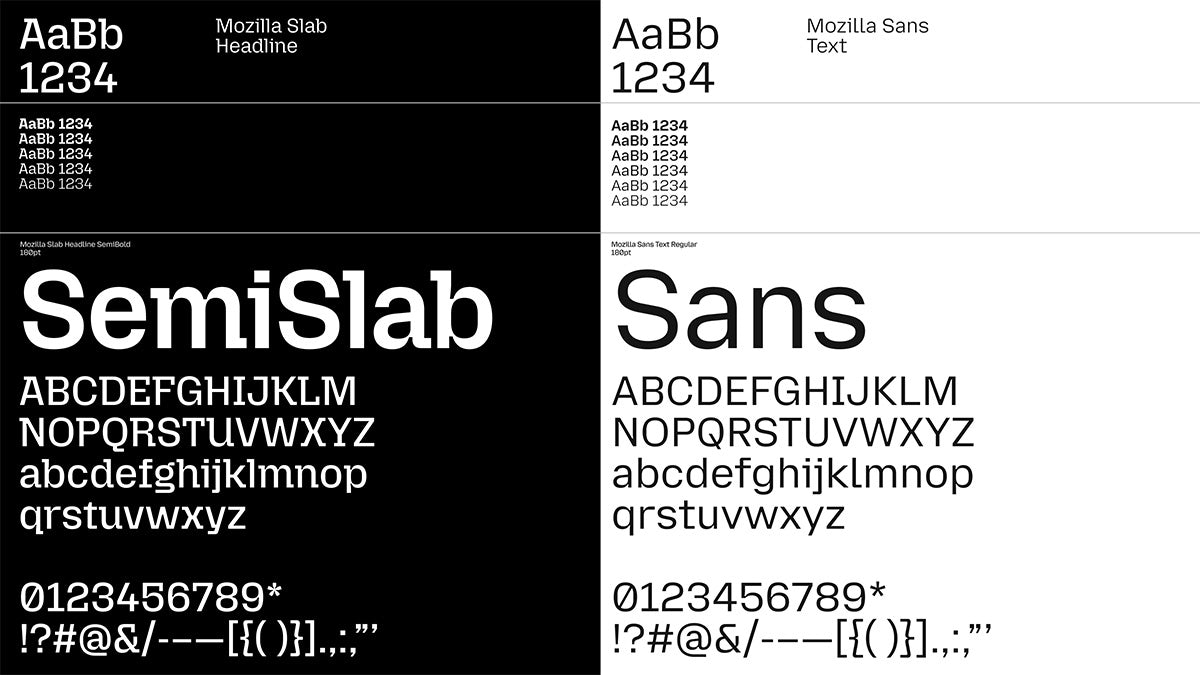
The wider identity features new typefaces created in collaboration with Studio Drama, including Mozilla Semi-Slab – an evolution of its previous semi-slab – which was chosen to differentiate Mozilla from other tech brands that tend to favour sans-serifs. However, sans-serifs do make a minor appearance here in the form of Mozilla Sans and Mozilla Sans Text.
The ‘M’ is rotated 90 degrees to create a flag motif, which seems to channel its brand promise as a flagbearer for a more open and accessible internet. There is also an ASCII-style version of the flag logo, nodding to its roots in the internet’s wild west, while a further suite of simple motifs inspired by the flag will appear across the identity.
The logo is designed to resemble a dinosaur, thanks to a pixel that’s been “displaced” to represent its eye, harking back to the Mozilla T-Rex mascot which had been drawn by Shepard Fairey (the name Mozilla is a portmanteau of ‘mosaic’ and ‘Godzilla’). This is joined by an animated version that fleshes out the dinosaur figure.
These are rendered in both a black and white version and a green version, tying into the palette seen across the identity.
“We intentionally designed a system, aptly named ‘Grassroots to Government’, that ensures the brand resonates with our breadth of audiences, from builders to advocates, changemakers to activists,” says Mozilla global head of brand Amy Bebbington. “It speaks to grassroots coders developing tools to empower users, government officials advocating for better internet safety laws, and everyday consumers looking to regain control of their digital lives.”
Latest from CR


