Olympic Museum unveils a versatile rebrand
Studio Blackburn talks to us about creating a new identity for the Swiss museum that can flex for a global audience
The Olympic Museum in Lausanne, Switzerland is home to the largest collection of Olympic artefacts in the world, with more than 100,000 pieces in its care.
With the Olympics being a truly global affair, the museum had to reconsider how people around the world can still interact with it even if they can’t necessarily get to the museum itself.
This demanded a digital-ready identity – a key consideration facing Studio Blackburn when it undertook the job of rebranding the museum, which has dropped ‘the’ from its name and wordmark. The identity would need to be robust and versatile, while having enough personality to cut through the noise in online spaces and position it as a cultural institution as much as a sporting one.
It also needed to feel unique while staying in tune with the overarching Olympic identity, refreshed back in 2022 by Hulse & Durrell and the IOC. “In undertaking this work, a key ask was that we align with the Olympic brand as a whole,” explains Studio Blackburn creative director Mark Jones.
“Throughout the process we carefully selected a handful of elements for the core brand whilst making considered additions in order to achieve a brand identity that has its own look and feel whilst not being a random accessory to the bigger picture,” explains Jones.
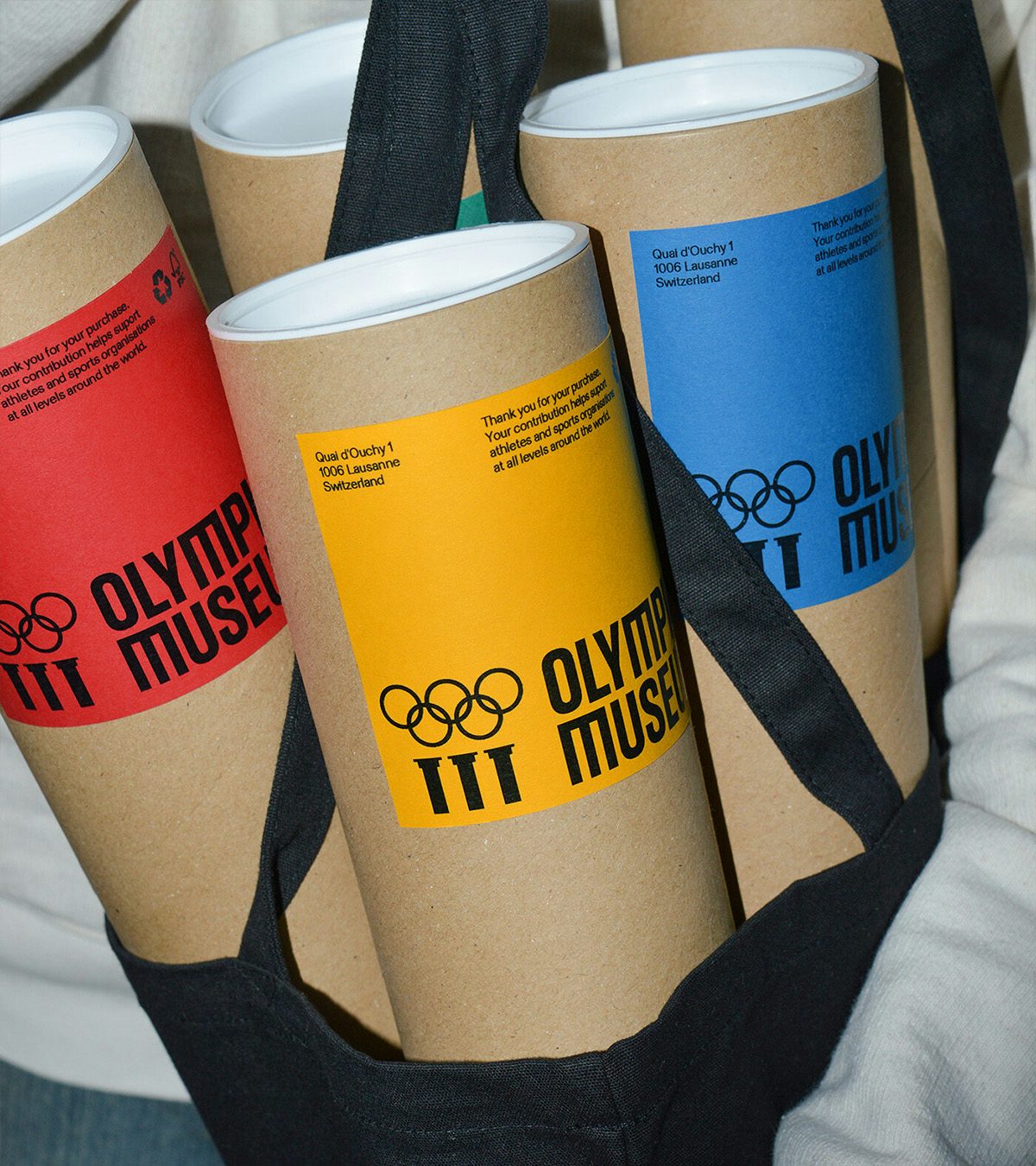
The Olympic colours naturally provide the foundations of the museum’s identity, but another way of preserving the connection to the Olympic masterbrand was through the typeface.
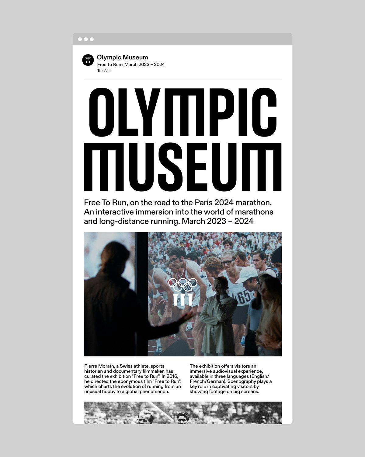
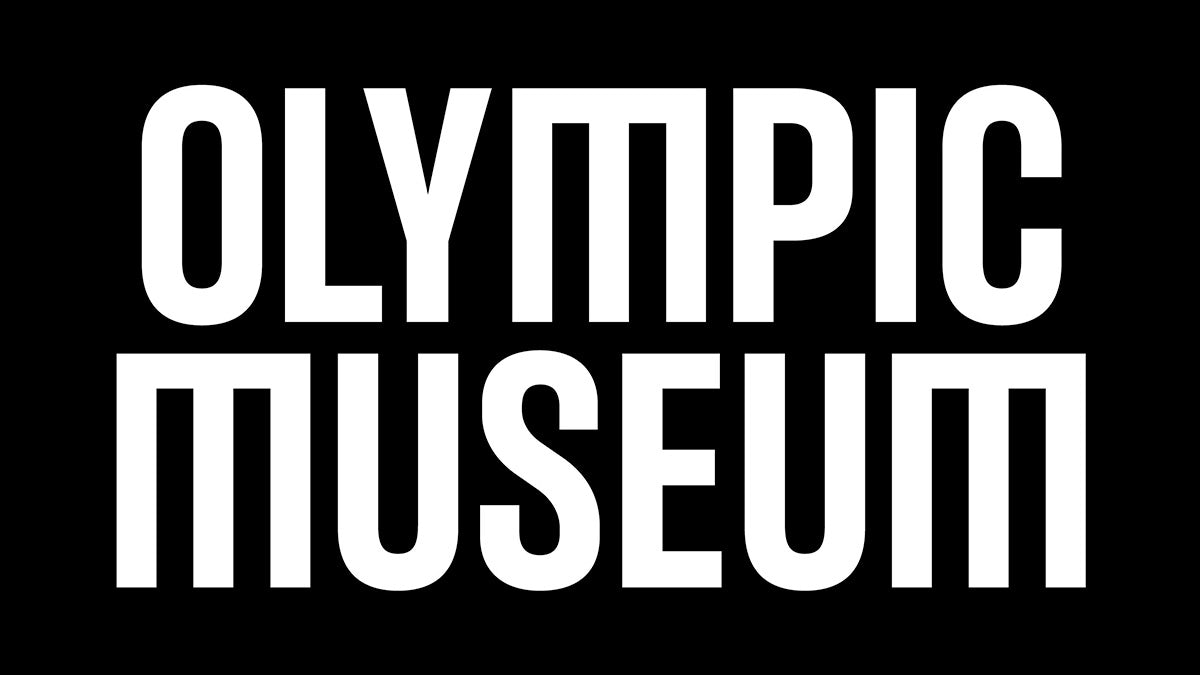
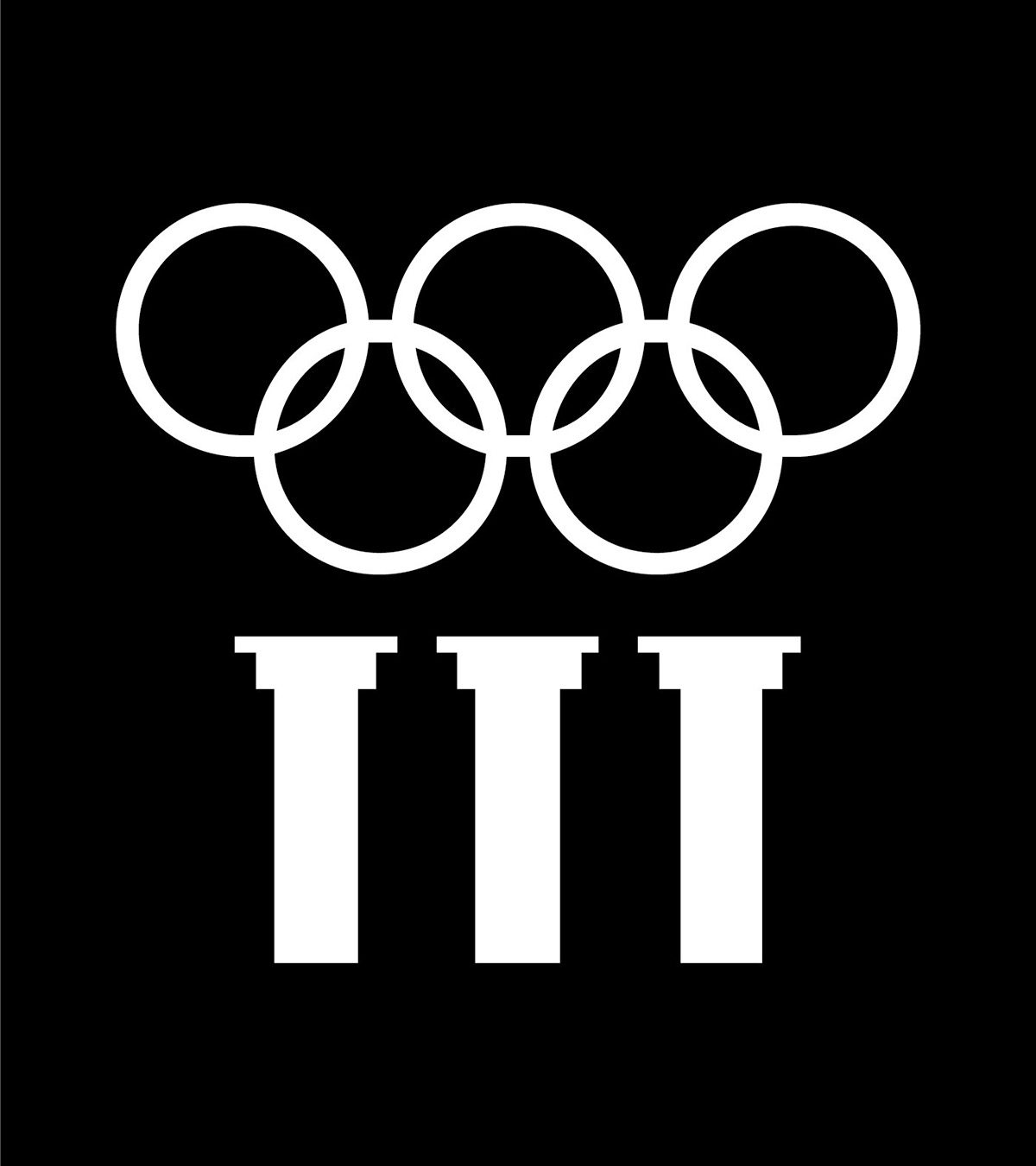
The Olympic Headline typeface appears across the identity, including in the wordmark. It works particularly well here as, Jones explains, it has “a pillar-like quality” that echoes the logo, which itself has been modestly tweaked from the existing design. Yet the typeface was also an opportunity for differentiation, so the team introduced a modified ‘M’ that cleverly picks up the pillar motif of the museum’s logo.
The identity had to cater not just to a global audience interacting with the museum remotely, but also to the multiple languages used by the museum itself in Switzerland. “Throughout the design process it was always at the front of our mind that the brand identity would be communicating to both a local and global audience,” Jones says.
“As the museum is a physical space there will always be the ability for it to be enjoyed by tourists and locals to Lausanne,” he explains. “This said, there has also been a massive effort to improve the online presence of the museum, expanding their reach and giving everyone the ability to interact with and enjoy the artefacts and Olympism as a whole from anywhere in the world.”
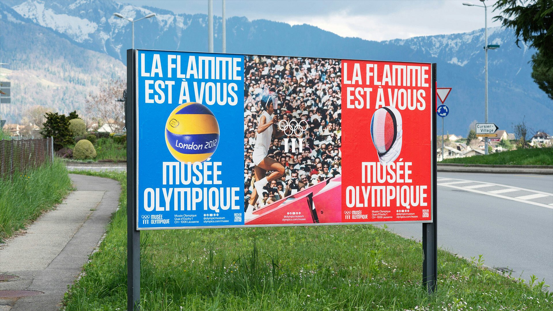
The identity will appear everywhere from museum displays and wayfinding to online touchpoints to promotional materials, including posters designed by the studio to continue driving interest in its permanent collection in between temporary exhibitions.
Jones says that the studio was most preoccupied with doing the museum justice and “creating something that will last for many years to come. We provided a select handful of concepts in the initial phase and we were intrigued by the enthusiasm for the route that became the final outcome. It took several revisions to ensure it was not only visually appealing but also legible and effective. Sorry to be clichéd but we have actually enjoyed the whole process and are thrilled with the outcome which is working really well for the Museum. La flamme est à vous!”