
Samar Maakaroun’s lyrical designs for an Arabic phrase book
The designer and Pentagram partner talks to us about balancing multiple scripts and voices in the layouts, cover and typographic illustrations found in Haraka Baraka
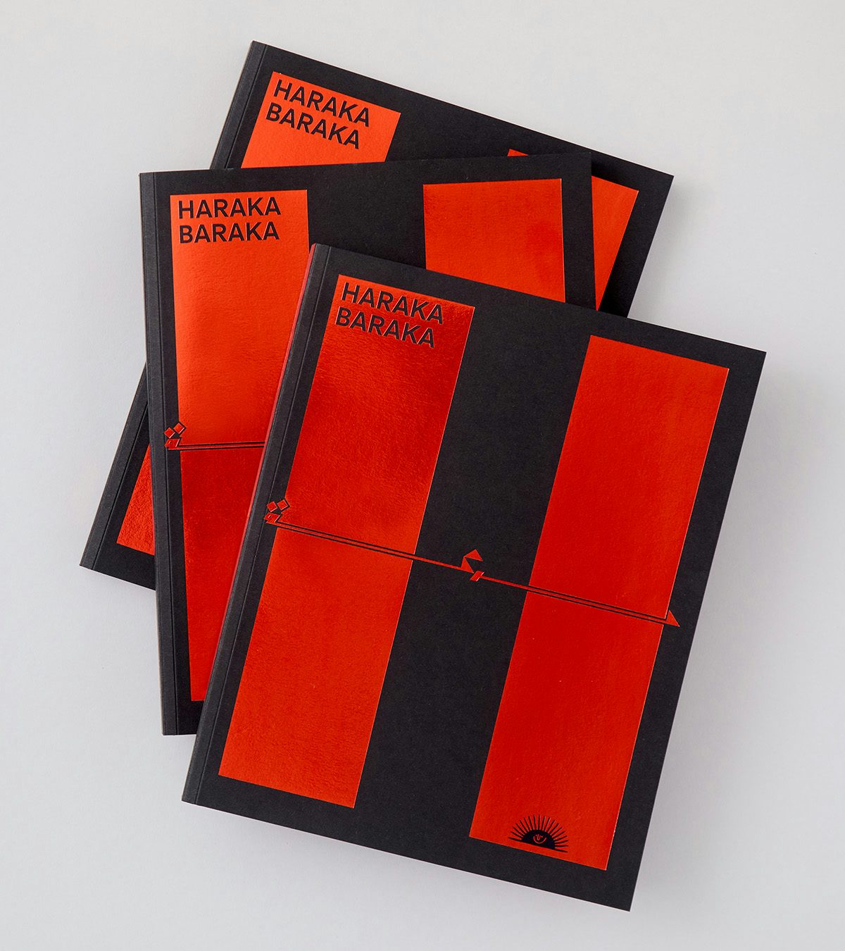
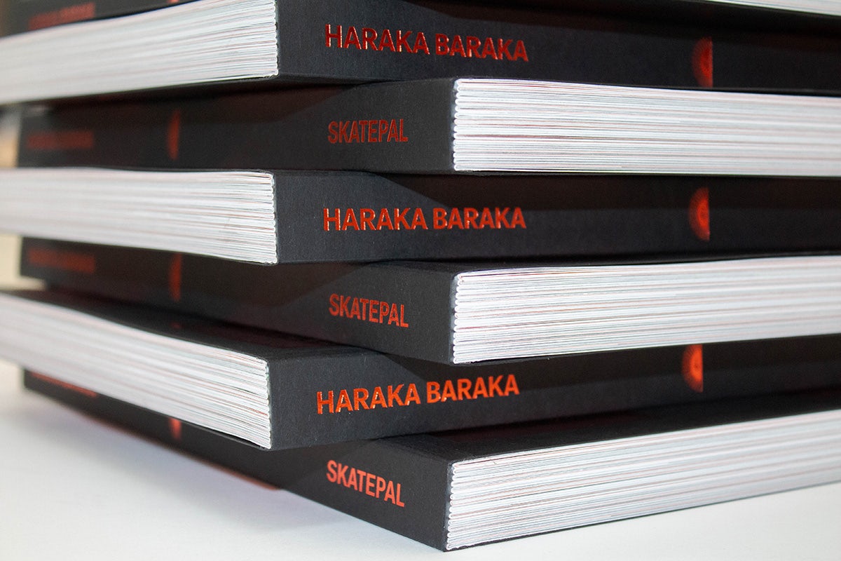
‘Haraka baraka’ is a term found across much of the Arabic-speaking world, particularly the Levant, which translates to ‘movement is a blessing’ in English – referring to the positive effects of play and activity. The idiom is borrowed for the title of a new book of Arabic proverbs by SkatePal, an organisation set up in 2013 to support young people in Palestine through skateboarding, and Pentagram partner Samar Maakaroun, who led the book’s design.
Yet the term ‘haraka baraka’ is more than just the book’s name. The meaning of the phrase can be found across the book’s lyrical, free-flowing blend of language, illustration, typography and photography.
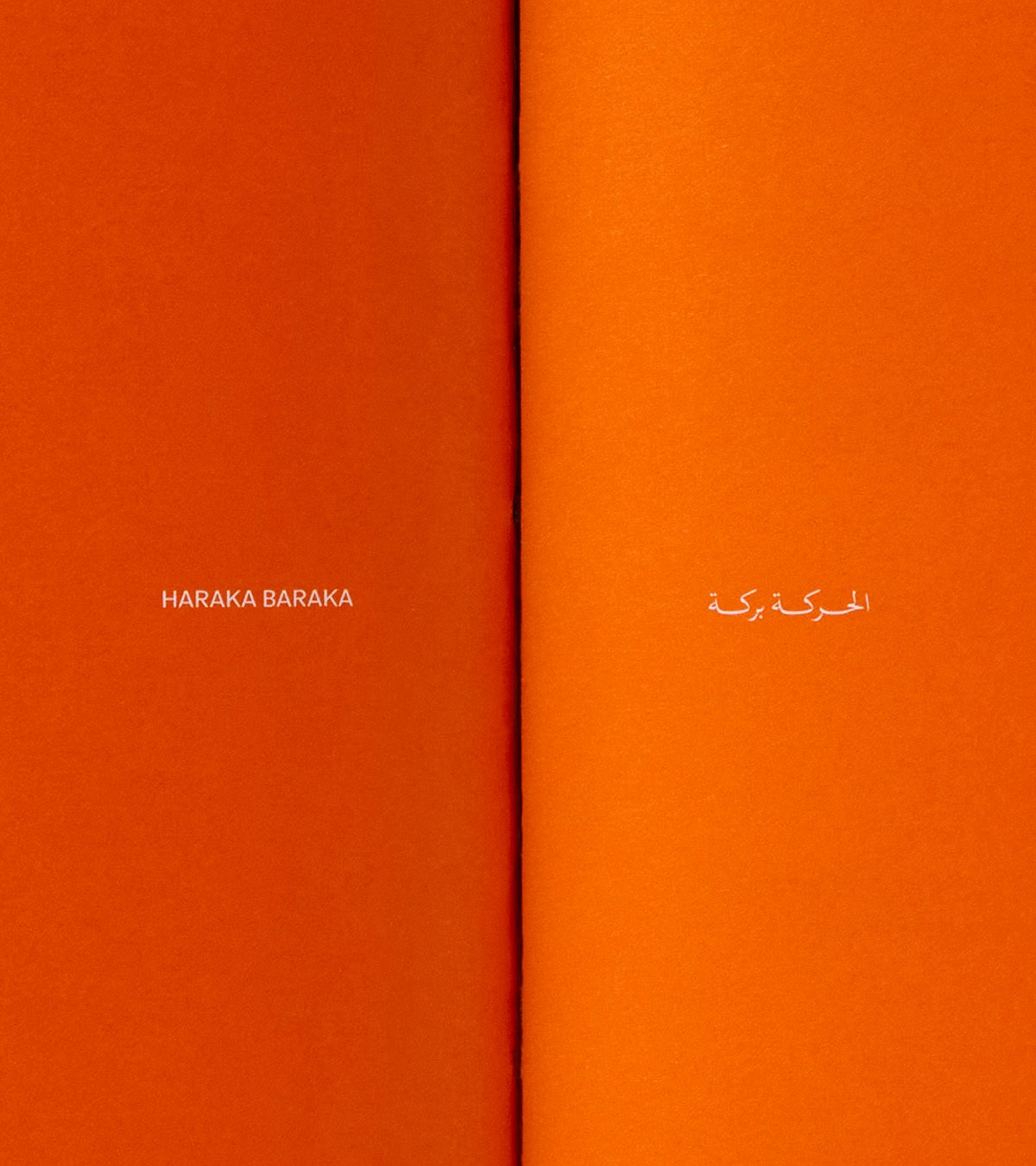
The backbone of the book comes from questionnaires with members of SkatePal’s community and the wider Palestinian diaspora, who shared their back stories and favourite Arabic phrases and idioms. These appear in the book in English and in Arabic, which typically read from left to right and right to left respectively. Rather than allocate half of the book to each language, Maakaroun embedded the book’s spirit of exchange and conversation in the design by featuring both Arabic and English on the same page.
This is echoed in the book’s cover, which was the last element to be designed. “We wanted something bold and arresting, and since the book inside had a variety of script styles, we toyed with more cursive forms, and looked at different relationships between the two languages. In my work I like to explore that relationship, in the spirit of the sum of parts is greater than the whole,” says the Beirut-born, London-based designer.
“We landed on this design that integrates the Arabic words for ‘Haraka Baraka’ in the crossbars of the letters ‘H’ and ‘B’. It could feel a little cryptic to the non-Arabic reader but I like to create things that can be discovered slowly, and that acquire new meanings as we learn more.”
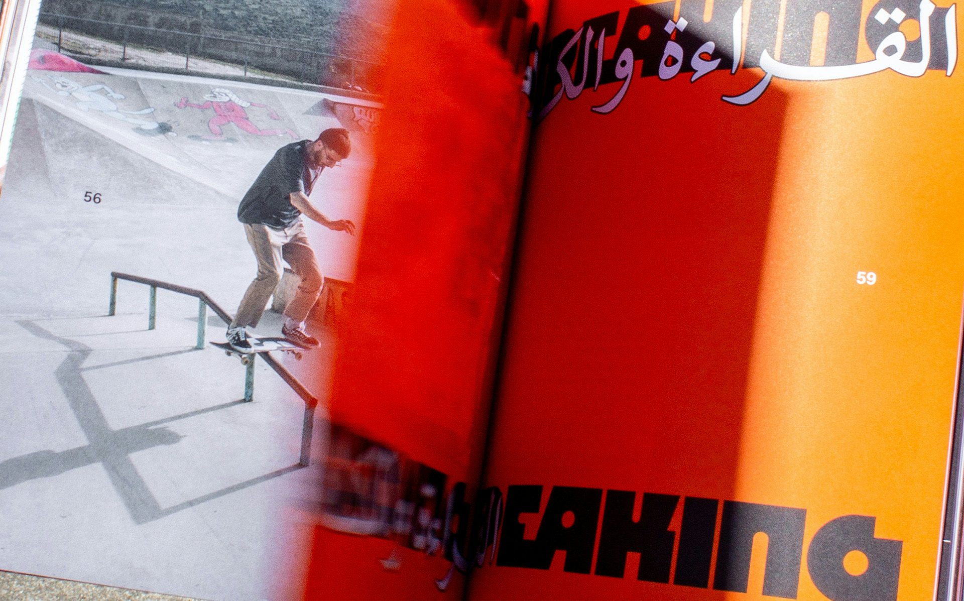
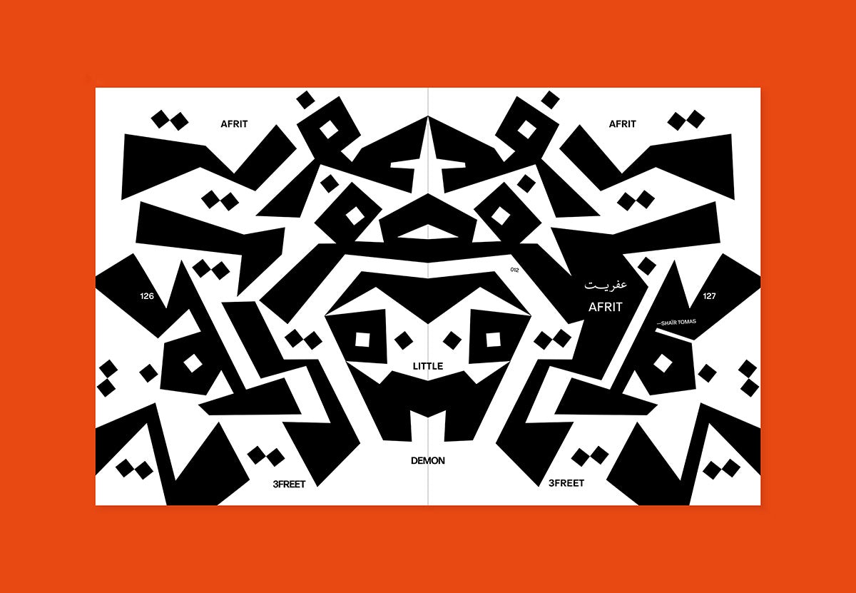
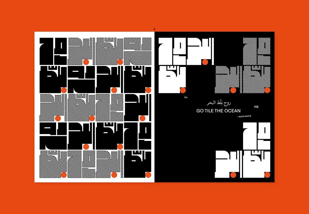
The book is interspersed with photographs of skateboarding and of everyday life taken by a group of contributors, which are joined by typographic illustrations showcasing 22 phrases and idioms that came up in the Q&As. “My favourite in the book is ‘go tile the ocean’, because it is a very visual sentence, a much more powerful statement than telling someone to go away,” says Maakaroun.
While some phrases were new to her – like ‘he who doesn’t know the falcon, grills it’, meaning someone who underappreciates the value of something – most are found in some form across all Levantine countries, she says. “‘The camel limps from its lip’ is a variation on one that I have heard before, ‘the camel limps from its ear’, still conveying the same meaning, that of a ridiculous excuse.
“This universality, the sense of continuity, the bridging of generations and geographies is what I continuously explore in my work, especially focusing on the ability of language to connect and create mutual understanding in an ever-so-divided world.”
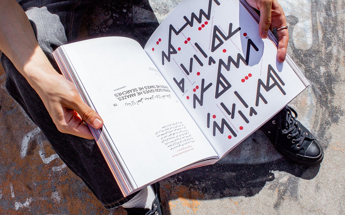
Maakaroun began the process of visually translating the idioms into typographic illustrations by creating sketches in a range of tools, including an iPad, calligraphic pen, pencils, brushes, and more. These were then taken on by Jacob Chung in Maakaroun’s team, who helped with adding layers and textures to the original Arabic sketches and designing the English counterparts.
“The purpose was to be eclectic in style, lean into the variety and richness of the Arabic script, and make each spread feel unique yet consistent with the rest of the book.” It’s emblematic of the entire project, which gave Maakaroun the freedom to explore the boundaries of design, far from the legibility constraints that she has with commercial projects, and to “create different forms and free Arabic typography from the shackles of tradition, and what is traditionally judged to be right or wrong”.
The project began in 2022 but has taken on a new meaning since Israel’s war on Palestine, which has killed nearly 40,000 Palestinians and caused a humanitarian crisis. “The words within, for example, ‘we are alive’, feel amplified and even more potent,” Maakaroun says.
“Following the events of 7 October, we did debate as a group whether it would be meaningful to publish this. What can a book do in the face of such a scale of destruction? So we put the project on hold for a few months, hoping, perhaps naïvely, for the situation to come to an end.” Yet they eventually made the decision to publish it, “if nothing else as an act of resistance, to claim the space we intended to occupy, and to try in vain to search for some beauty and hope in grief”.
All proceeds from Haraka Baraka go to SkatePal; skatepal.co.uk


