Studio Nari creates identity for cult soda brand
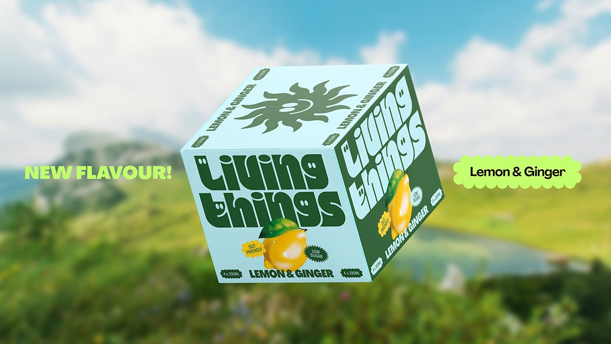
Living Things has revealed an uplifting identity and packaging design as it eyes up nationwide supermarket expansion
Living Things, a ‘next-gen’ prebiotic soda brand, recently joined forces with renowned London design agency Studio Nari to establish a forward-facing identity. Marketing their drinks as low sugar, all natural and “belly-loving”, the team at Living Things was keen to create a brand that feels just as much at home in a trendy café as it does a high street supermarket.
Studio Nari was tasked not only with the visual aspects of the branding, but also selecting the brand name, which the team says was chosen from a list of hundreds of options.
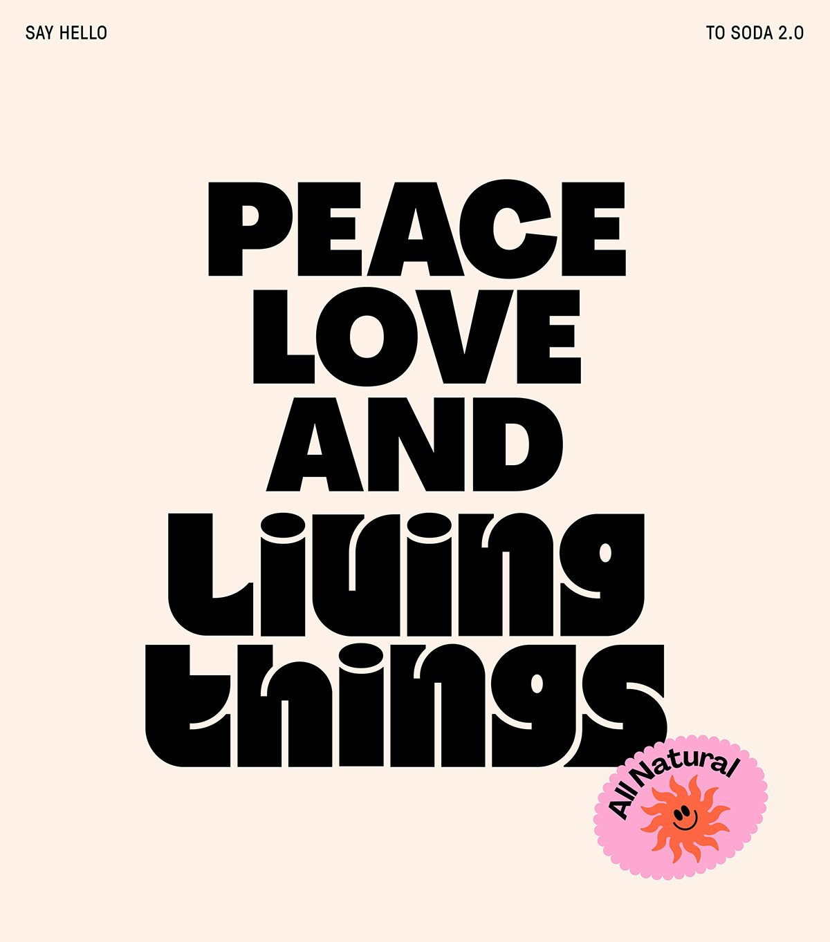
They eventually settled on Living Things due to its “playful, provocative and abstract” qualities which nod to gut health in a fun way. “The focus was on amplifying the enjoyable, feel-good, and guilt-free aspects of the product, and transmitting this through an eye-catching identity that jumped off the shelf,” according to the Nari team.
At the heart of this is a new wordmark that reflects the energy and dynamism of the brand name. Utilising a bold, curvy typeface reminiscent of bodies and bubbles, the wordmark helps the drinks feel accessible and inviting. It also serves to counter the potentially negative connotations some might attach to prebiotic sodas, considering them dull, tasteless or too ‘healthy’. The carefree letterforms aim to show there is nothing to be afraid of.
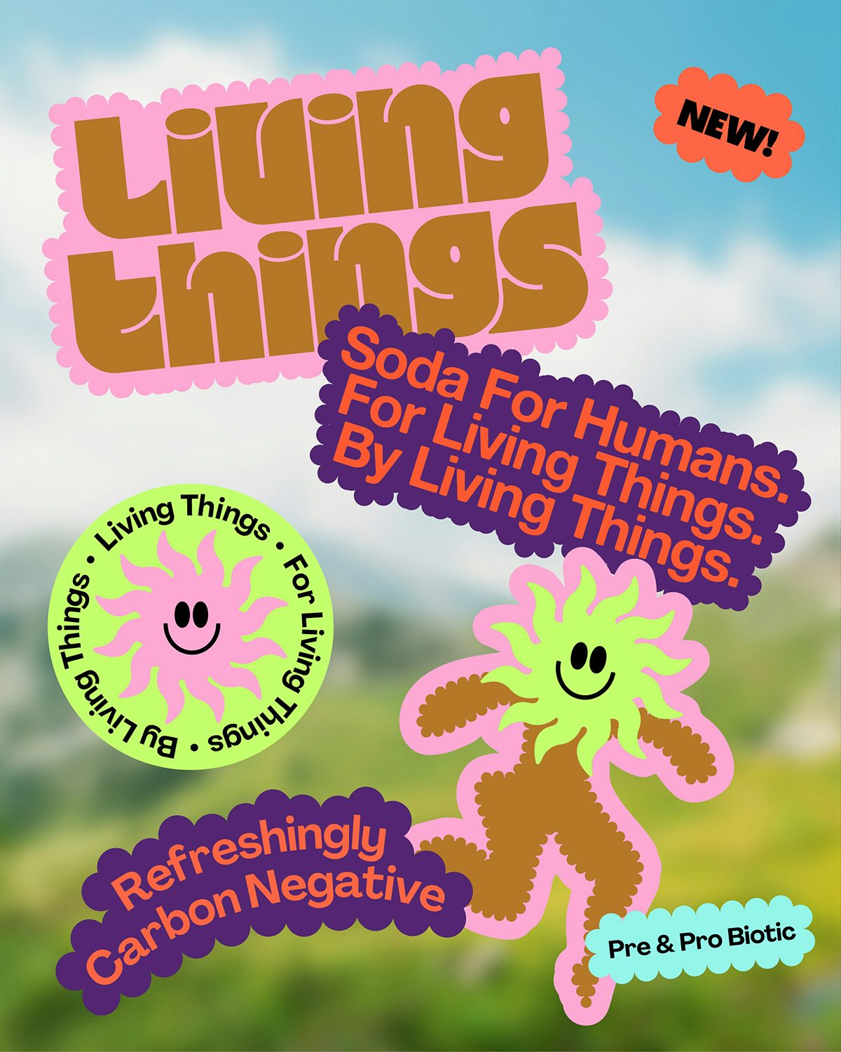
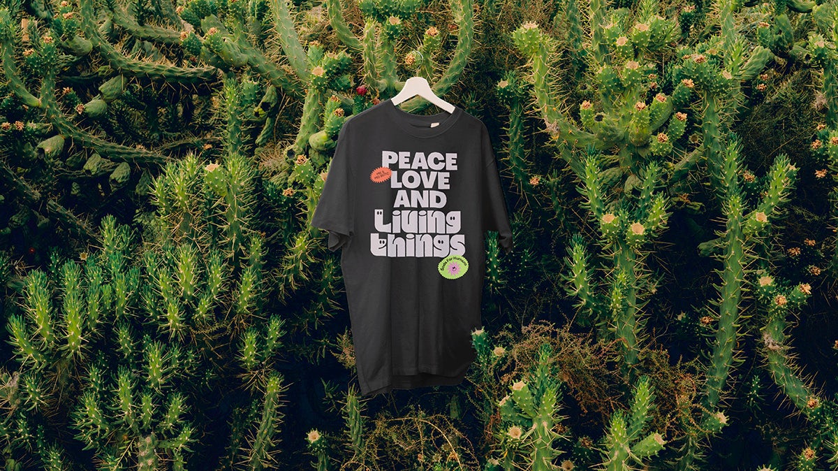
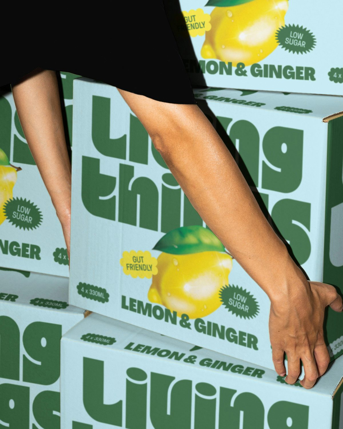
This notion is expressed across the rest of the identity, reinforced by elements such as a playful sticker collection that emphasises the benefits of drinking Living Things. These include the drinks being carbon negative, low sugar and ‘made for humans’. The stickers come to life through simple, fun animations that showcase the natural ingredients and the mouth-watering tastes on offer.
Finally, whimsical and irreverent photography establishes the brand as a purveyor of health and positivity. This imagery features the kind of vibrancy that can be found in the rest of the branding, with lively colour palettes that complement the bold packaging. Together, these elements intend to help Living Things stand out in the market and on the shelf.