
Verizon refreshes its branding
The telecoms provider’s updated logo and design system coincides with the launch of a new brand film and a suite of rewards packages
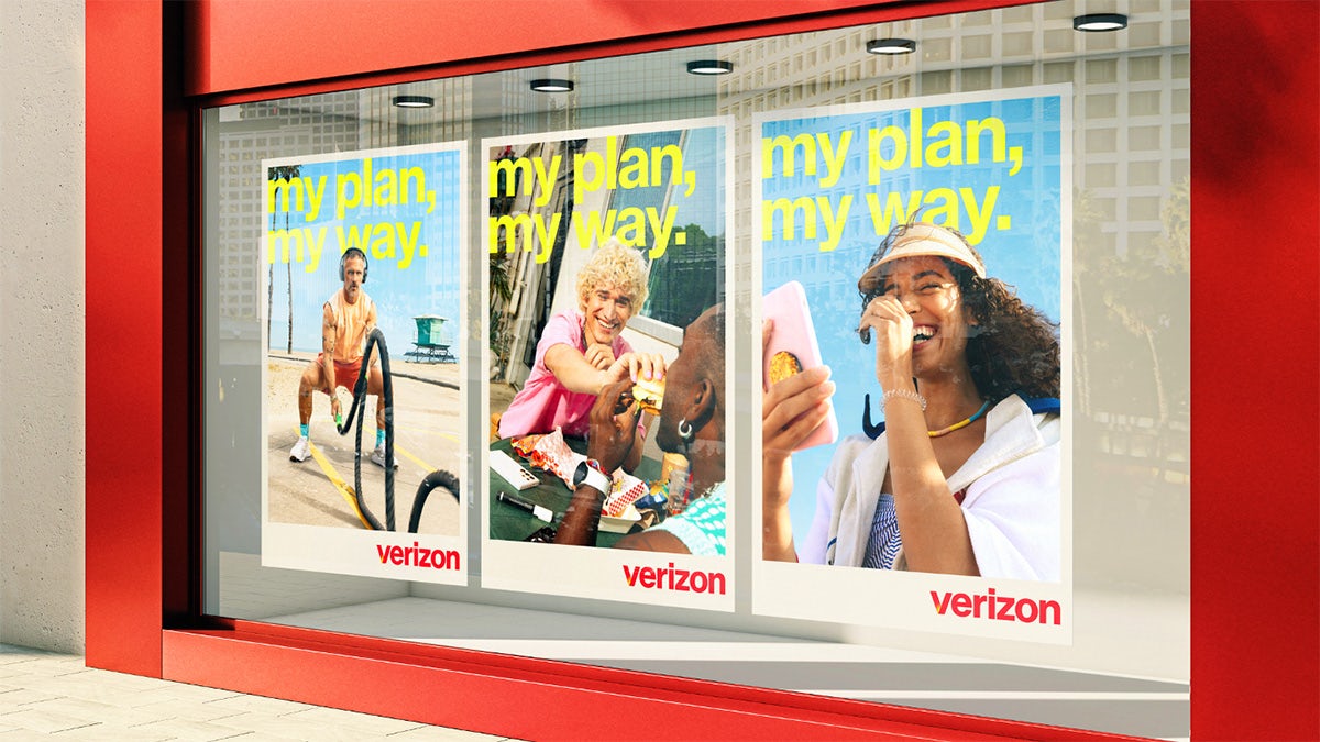
Verizon has revealed an identity refresh created in partnership with Turner Duckworth, as the telecoms provider announces a new suite of customer benefits and bundles.
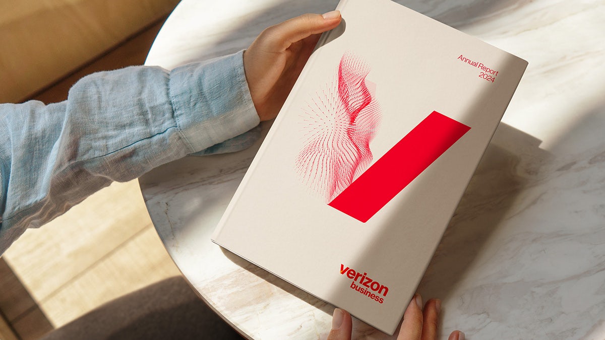
A new glowing ‘V’ logo has been introduced, replacing the previous tick design developed by Michael Bierut at Pentagram back in 2015 – itself an iteration of Landor’s initial design from 2000. Though it has been likened to Netflix’s ‘N’ symbol by some, the new logo feels more in keeping with today’s tastes.

The logo update is joined by a refreshed colour palette and photography style, all of which will be implemented across digital products including the website and apps, retail spaces, and other brand collateral.
“Verizon is a strong, trusted brand that plays a critical role in people’s lives, but most of what we do is often invisible and behind the scenes. We want to make the invisible, visible,” Verizon CMO Leslie Berland said in a statement.
“The new logo, design system and creative approach pulls inspiration from the company’s heritage while infusing the energy, vibrancy, and experience of life powered by everything Verizon offers.”
The sense of heritage factors into its new brand film, which opens with a reference to Verizon’s long-running ‘Can you hear me now?’ line that has been in use for the best part of ten years. The spot goes on to emphasise the ‘now’ by showing how its services allow people to do anything they want to in the moment.
Latest from CR


